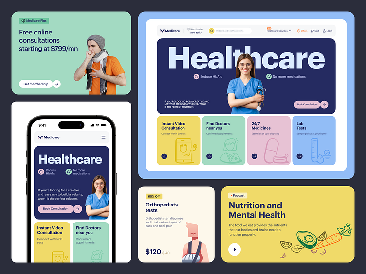
Healthcare - Website Design
You may already have seen our Medicare AI app; now, let's explore its website counterpart. Along with AI-integrated features, we also focused on visual branding in this healthcare project. We picked blue to represent trust, and yellow and seafoam green create a harmonious and vibrant contrast. Together, they give the whole design a nice healthcare touch that users will surely enjoy.What are your thoughts on this unique visual design concept?
Hey, did you miss the previous shots on the app version?
See here👇
⭕ On-Demand Doctor Booking App
⭕ Healthcare App | Doctor Discovery & Appointment
⭕ Find Doctor With AI-Powered Healthcare Mobile App
⭕ AI Healthcare | Pharmacy Finder App
⭕ Skin Disease Scan | AI Skincare App Design
⭕ Healthcare Mobile App
We appreciate your interest, Dribbblers! 😍
Schedule a call at ☎️ 👉🏼 Calendly.com
Let's talk about your project..
✉️ hello@musemind.agency
Website 🌐 musemind.agency
Explore Our Design Case Study Featuring ➡️ Behance
Let's Check Our Others Dribbble Profile:
musemind saas • musemind mobile • musemind branding
Follow us to see more exciting shots and insights on:
Linkedin I Instagram I Twitter I Medium I Facebook I Webflow I WhatsApp


