Adrien's Love
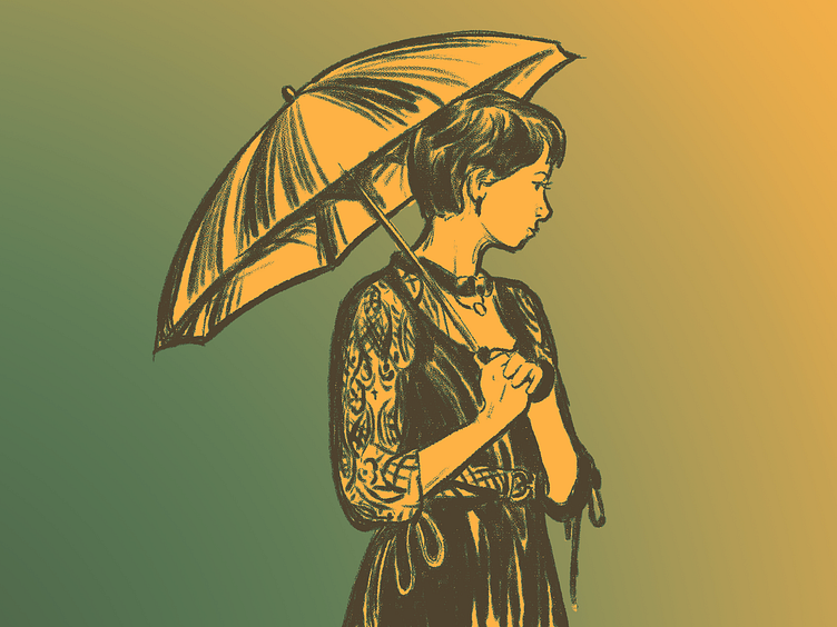
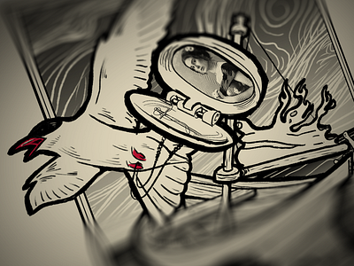
As explained earlier, the story about Adrien involves chasing after his love. The picture of the woman in the medallion was one of the elements we were not sure about. Hence, it begged for a redo. This is the result! I love this so much more than the first try. Hand drawn beats a filtered photo in this case, it suits the art work much better.
The colorful artwork is not quite what we are after for the album art, but I liked playing around with it anyway. The bright colors make it much more expressive for the art on its own. Though that black and white suits the artwork, the colorful illustrations create a surprising effect. It seems to shift the contrast, making every variant lay focus on something else.
Besides that, gradient map is always fun to play around with. It's like going fully Warhol on my drawings. :)


