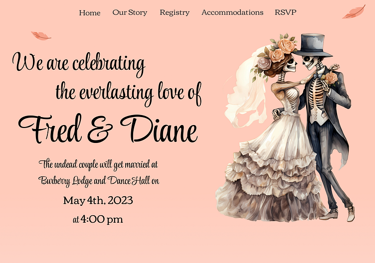
Undead Wedding Landing Page
Project Overview:
This was created for a Design Challenge from UpLabs for a Wedding Website. The prompt was vague and noted that we were able to test our creativity and have fun with the website.
Ideation:
I stumbled across this Day of the Dead-themed couple while looking for icons on Creative Fabrica and fell in love with the idea of using skeletons on a wedding page cause who does that?
Challenges
The biggest challenge for this design was choosing the colors because I didn't want it to have a Halloween feel to it at all. I wanted to try to keep the feminine feel to the design that most weddings have. I also wanted it to be a clean design without any major distractions. I managed to pull a similar to the colors used for this off of the flower crown and the more I built the site the more it came to life.
What I Would Do Differently
I would remove the reception information from the bottom of the page and have it on a separate page with all the event details on it. It just feels off-put there to me. I would also change the style of the RSVP to appear more like a footer on the home page and add a CTA button at the top leading to a popup for RSVPing to the wedding.
Lastly, I would change the menu at the top to a closed menu that opens on click. The words there have always felt out of place.


