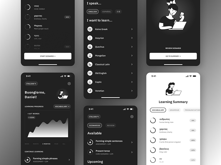
Language Learning App • Mobile • Minimalist • Dark UI
Hello, Designer Community! 👋
For a few months now, I've been designing and developing an AI-powered app that teaches endangered languages. To focus on simplicity, I've adopted a 3-bit grayscale color scheme that supports both dark and light UIs.
As always, thank you kindly for the view! Feedback is always appreciated!
Please drop a ❤️ if you like what I'm working on!
----------
Enjoy my work? I'd love to connect here and everywhere else!
More by dmartuk View profile
Like


