Sarah Hutting's Photography


kerdonstuart.com
⎻⎻⎻⎻⎻⎻⎻
What do you guys think?
💛 Press "L' to show some love and share your 💬 comments in the section below!
Follow Me: LinkedIn | Instagram
View Website
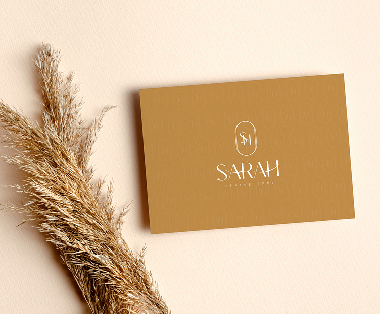
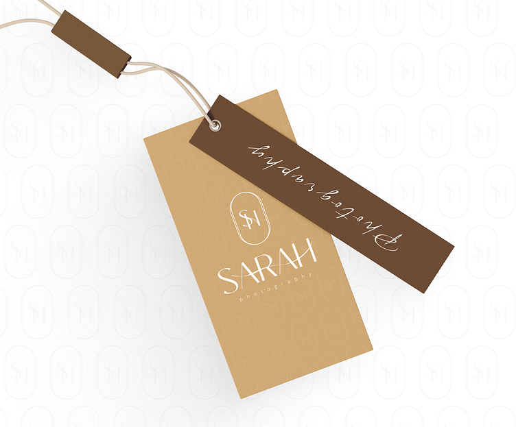
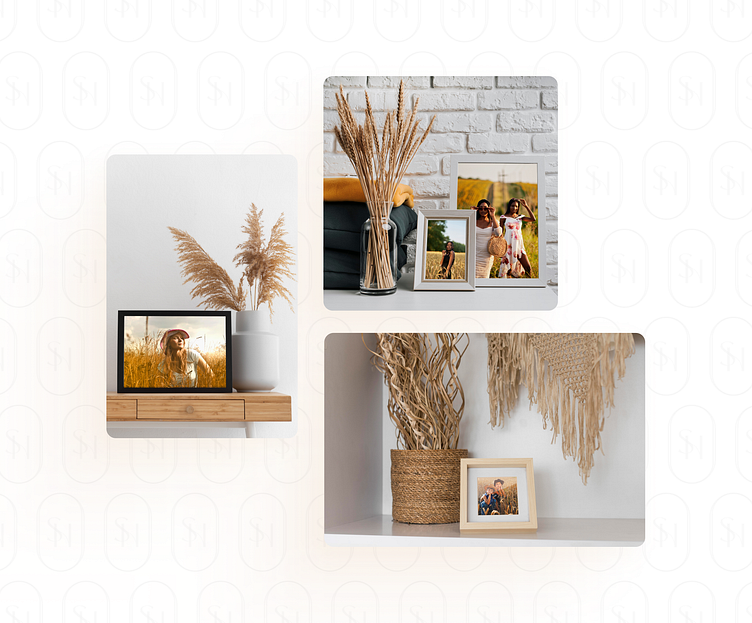
Logo Design
The two letters are elegantly intertwined, symbolizing the fusion of artistry and professionalism that defines Sarah Hutting's Photograph.

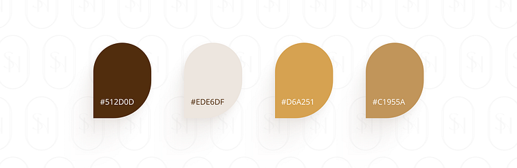
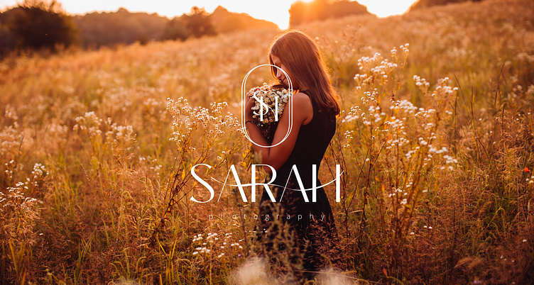
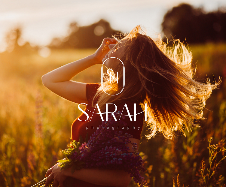
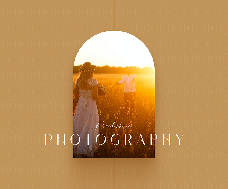
Color Scheme
Gold/Brown: Gold and brown are chosen to represent the timeless, warm, and inviting nature of photography. Gold signifies excellence and sophistication, while brown conveys a sense of natural beauty and simplicity.
White: White complements the primary colour scheme and signifies purity, clarity, and a focus on details. It also provides a clean canvas for showcasing photography.