Luminate Rebrand + Case Study
Logo Insights
The Luminate logo uses the first letter of the brand name as a visual mechanism for its core offering: the opportunity to find objective, meaningful data that leads to better decisions for people in the entertainment industry.
Its presentation is unconventional and unmistakable. Built from a typeface called FK Screamer, the logo carries a level of authority and confidence that many simply can't. The thickness of the letters, upward trajectory, and uppercase formatting invokes a masthead from a subculture magazine — one everyone is going to want to read.
This L frame opens up a number of possibilities for framing content, imagery, and even visual language.
Visual Identity
Energetic, edgy, and bold, this palette is full of retina rockers ready for any opportunity to shine. Setting typography and the logo in these colors ensures ultra-high contrast.
The opportunity of this type of extended palette also allows Luminate to amplify or reduce the perceived energy when and where it's needed in the brand identity.
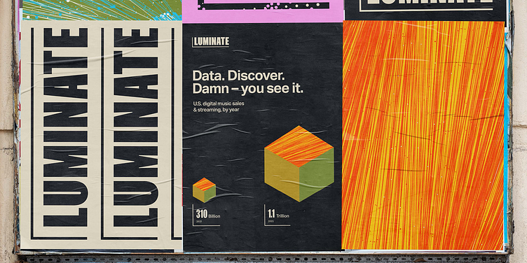
We set out in search of “what data looks like.” A true large-scale data visualization is powerful: tons of information made easily digestible, visually. Boiled down to its essence, data visualization is a series of dots and lines. So naturally, we explored this within the brand palette.
By playing with scale and detailed crops, these abstractions become a sort of patternwork. Higher contrast versions can draw the eye or create visual intrigue. At the same time, lower contrast, more monochromatic versions can be created for more of a textural element.
Check out the full case study: https://focuslab.agency/work/luminate
------
Looking for a brand agency? We would love to hear from you.
Email us: hello@focuslabllc.com

