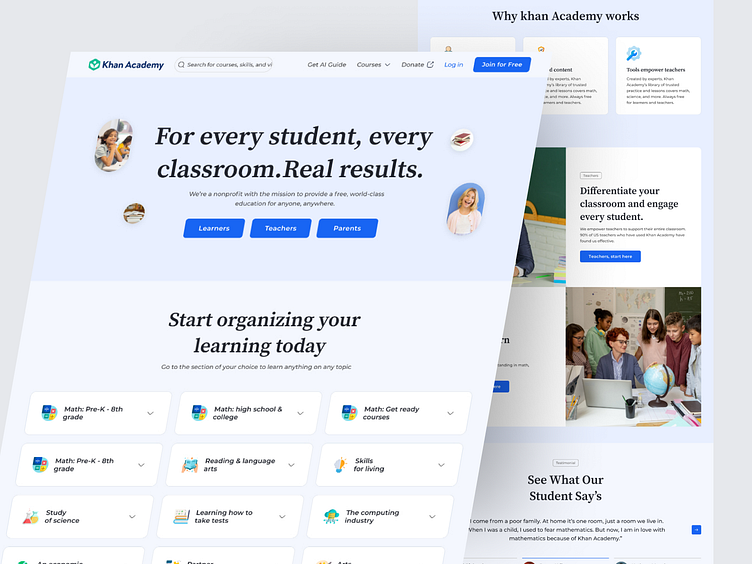
The Khan Academy website UX issues were found and UI redesign
Hello Everyone!..
This is my new exploration of an Educational platform landing page named Khan Academy. With Khan Academy, we can make it easier for ourselves to have proper education online. Scroll down to see the full case study...
Problem
Cluttered Design: If the landing page is cluttered with too much information, it can overwhelm users and make it difficult for them to find what they're looking for. A clean and organized layout is essential.
Unclear Navigation: If it's not immediately clear how to navigate the site or find specific content, users may become frustrated. The navigation should be intuitive and user-friendly.
Clear Call to Action (CTA): A landing page should have a clear and compelling CTA that directs users on what to do next, such as signing up, exploring courses, or accessing resources.
Ineffective Use of Imagery: The use of images and graphics on a landing page is important, but if they are distracting, irrelevant, or slow down the page, it can harm the user experience.
Poor Content Hierarchy: Content should be organized logically with clear headings, subheadings, and visual cues to guide users through the information.
Missing Social Proof: If there are user reviews, testimonials, or endorsements, they should be prominently displayed to build trust.
Inadequate Accessibility: The website should be designed with accessibility in mind, ensuring that it's usable by people with disabilities.
Solution
Cluttered Design: Simplify the design by reducing visual clutter, using whitespace, and prioritizing essential content. Remove unnecessary elements.
Unclear Navigation: Ensure a clear, user-friendly navigation structure with intuitive menus and labels. Consider using standard navigation patterns like a top menu or a sidebar.
Clear Call to Action (CTA): Create compelling and visible CTAs that guide users on what to do next. Make sure they stand out with contrasting colors and concise text.
Ineffective Use of Imagery: Use relevant and high-quality images that enhance the content. Optimize images for web use to prevent slow loading times.
Poor Content Hierarchy: Organize content with clear headings, subheadings, and visual cues. Prioritize the most important information and make it easily scannable.
Missing Social Proof: Showcase user reviews, testimonials, or endorsements prominently to build trust and credibility.
Inadequate Accessibility: Make the website accessible by following accessibility guidelines such as WCAG (Web Content Accessibility Guidelines) to accommodate users with disabilities.
Thanks for scrolling!
Interested in partnering with us?
Say hello at majarulislam25800@gmail.com
Skype: live:.cid.239fb2cef8d4ecfa
Telegram: +8801632177501
WhatsApp: +8801632177501

