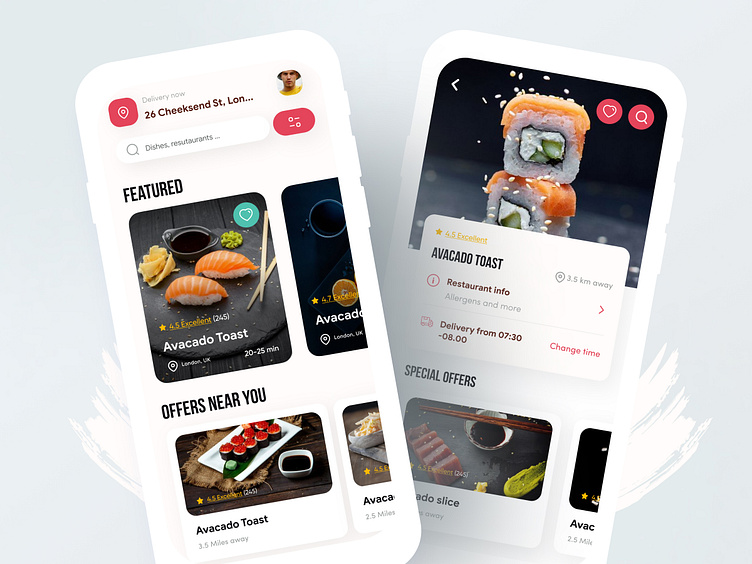
Food App UX/UI Case study
The ultimate goal was to drive user action—placing an order. Streamlined checkout processes, visually appealing confirmation screens, and strategically placed call-to-action buttons ensured a frictionless journey from exploration to conversion.
Capturing the user's attention was crucial, and I achieved this through visually striking imagery and a bold color palette that enticed users to explore the culinary world within the app. High-quality images of delicious dishes took center stage, accompanied by a simple and elegant interface that encouraged users to delve deeper into the app's offerings.
Seamless and intuitive navigation system made it easy for users to discover new cuisines, read enticing descriptions, and visualize their desired meals. Features like personalized recommendations and user reviews further fueled the desire for culinary exploration.
Stunning, high-resolution images of dishes were strategically placed to evoke emotions and stimulate appetite. This immersive imagery served as a powerful tool to keep users engaged and interested.
A simplified and intuitive checkout process minimized friction, ensuring users could convert their desire into action effortlessly. Progress indicators and clear calls-to-action guided users through the final steps.
This case study demonstrates that a strategically crafted UI/UX design, can not only grab attention and maintain interest but also instill desire and drive user actions, ultimately leading to a successful and enjoyable user experience.
