Explore Page Redesign for Streaming Services
Q: How could the related videos section of a streaming service be improved?
Q: How could the related videos section of a streaming service be improved?
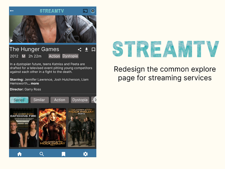
Potential A: My design for the Stream TV mobile app takes the approach of using categories for the “related videos” section which is located underneath the divider between the information section and the recommendations/”related videos” section.
The inspiration for this approach was taken by the explore page of YouTube which has “topics” selected based upon users recent search history.
The Design
Q: How is the proposed design different to YouTube?
A: Through the categories.
Youtube only filters videos based upon their topic such as “Gaming” and “Music”
My proposal uses multiple filters for the programs, such as:
“Series”
Programs that are in the same universe and are directly related to the show user’s clicked on.
“Similar”
Programs which users who liked the program users are looking at also liked.
“Action” and “Dystopia”
Programs with the same genres.
“Jenifer Lawrence” (only the “J” is seen in the frame).
Programs which also include the starring actors.
Garry Ross would be the next category if the scroll function was activated.
Programs with the same director.
Why is the Chromecast icon black when the other icons are white?
I aimed to draw attention to the Chormecast icon by making it a different colour; black. This also differentiates the Chromecast icon from its active and inactive states. The black being the inactive state and white being active.
I hypothesize that the black icon will encourage users to connect to their closest device when watching as their eyes are subconsciously drawn to this area of the screen. This may persuade users to watch a longer program or more episodes of a show once they’re connected to the Chromecast device as users are comfortable watching television.


