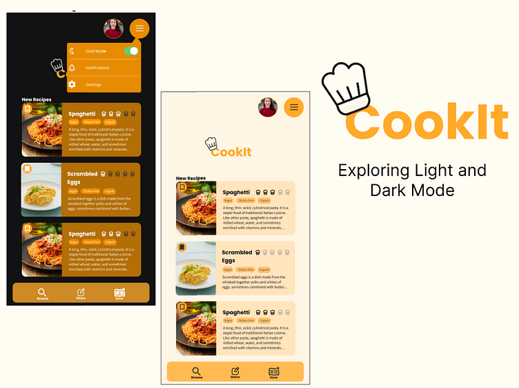
Light and Dark Mode
Light Mode Screens
Dark Mode
Design Rationale
After creating the light mode I copied the frames in Figma and changed their backgrounds to 121212 then started deciding on which colours would look best in the dark mode. 121212 is a WAG recommended colour for backgrounds with FFFFFF as the white for text on the black. Color | Accessibility Guidelines (carnegiemuseums.org) I ensured that elements which had the same colour in the light mode also did in the dark mode. Same amount of colours in the pallet. I changed some of the FFAA29 (orange) which included the drop down hamburger menu to E78B00 (darker orange) as it fit better with white text on top. I kept the logo in E78B00 as I don't want to change the user's perception of the brand or confuse them. I kept the bookmark background circle the same colour as the logo as it kept the site looking cohesive. I chose darker colours for the chef hats ranking system than in the light mode as the grey I originally chose didn't translate well with the food card background colour.
Accessibility
Above are screenshotted results from running the colour blind plugin in Figma which ensure that the colour contrast is acceptable and usable for all users.


