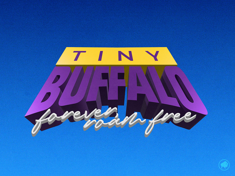
90s action
Messin' with some 3D text when this trickled out. No clue where I am going with this one... it feels a little too brutalist and chunky for my typical style.
Color palette and aggressiveness has me feelin' 90s vibes. My mind keeps circling back to the Dinosaurs tv show logo (the perspective tilted stone text with the egg for the O). Definitely gonna keep it around in my collection for use later (once I can find out a use for the logo).
Thanks for viewing; hope you enjoyed.
Liked what you saw and want to work together? Email me at nrundio@gmail.com
More by Nathan Rundio View profile
Like

