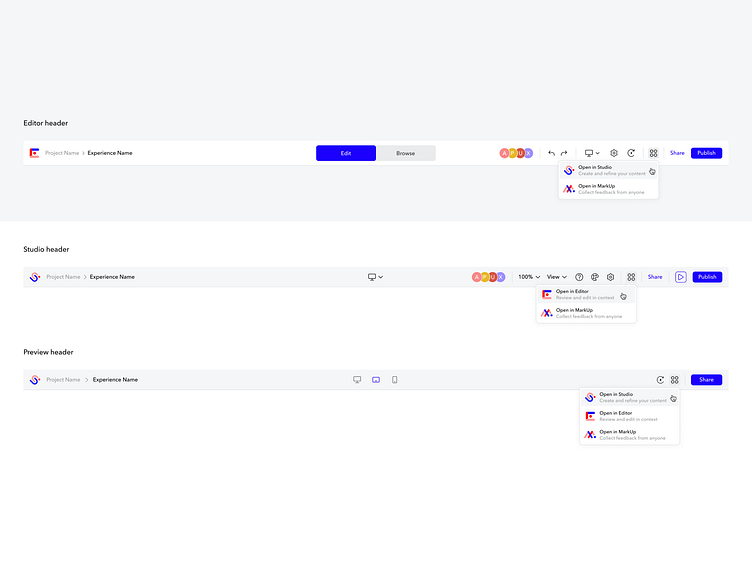
App switcher
Users working across the Ceros Admin, Studio, Editor, Chartblocks, and MarkUp lacked a sufficient way to navigate between these products. They also struggled to share content within these apps based on user roles and permissions of the sender and receiver. We introduced an app switcher dropdown that was placed in the header of each product as well as a new share CTA on the right side, and project/experience bread crumbing on the left side.
More by Devani Janssen View profile
Like
