Case Study: Acumen Notifier – UI Design
Case Study: Acumen Notifier – UI Design
CLIENT
Acumen Risk™
DELIVERABLES
Platform Design
Logo Design
Marketing campaign design support
Landing Pages
ABOUT
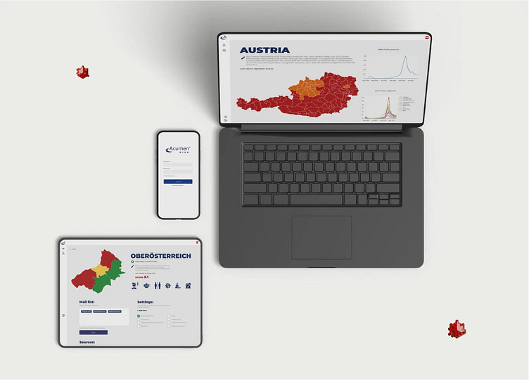
Acumen Risk™ is an international risk management company specializing in man-related risk management platforms with mobile extensions and intelligence services that are complemented and enhanced with state-of-the-art analytics and modeling. The Acumen Risk™ COVID Notifier system provides a solution to inform international, national, regional, and sub-regional organizations who need to stay up to date on all the relevant rules and regulations during the COVID crisis. The Acumen Risk™ COVID Notifier was created to assist companies in a dynamic environment and manage processes by obtaining and processing necessary information at the right time.
ABOUT THE PROJECT

Acumen Risk™ Notifier uses unique world-class and market-leading technology to help companies prepare and answer the latest regulations.The recent COVID – 19 crisis changed many businesses’ structures and made them dependable on the latest regulations. Those changes often pose complex challenges.The project goal was to create a user-friendly experience that allows users to easily navigate the app and not feel overwhelmed by its functionality. We also wanted to create an interface that would be easy for non-technical users to understand and use. The design is simple and clean, with bold colors and easy-to-read typography that lets users quickly find what information they need. With an intuitive user experience, easy navigation, and simple design Acumen Risk™ Notifier is a good fit for all stakeholders.
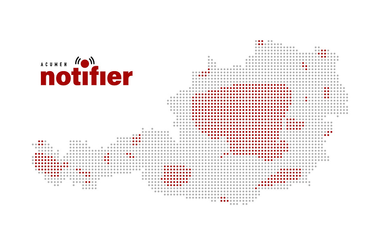
THE LOGO

The Acumen Risk™ COVID Notifier logo was designed to convey urgency and communicability. The red, black, and white color scheme is designed to stand out against a variety of backgrounds, while the font choice is meant to be easily recognizable at small sizes. In a world where people are constantly connected, we knew that the logo had to reflect the urgency of our client’s mission. Acumen Risk™ wanted to convey that people needed to be notified, and notified quickly.
The result is a simple red and black logo that conveys a sense of urgency but also has an air of confidence. It’s clear, concise, and will be recognizable at any size—which is important when trying to communicate with people on their phones.
THE COLORS
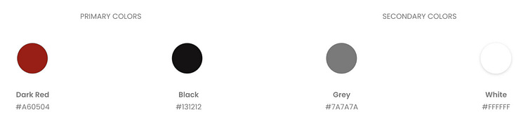
The mix of red and black gives the logo a forceful sense, while the usage of white space makes it easy to read. This logo is intended to be dramatic and impactful, with a simple color palette and bold lettering.
THE TYPOGRAPHY
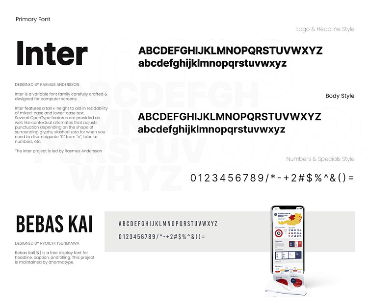
The Acumen Risk™ COVID Notifier logo is bold and clean, with a hint of typography.
The Inter typeface is contemporary and sleek, and the logo is a solid color with no shading or gradients. The rounded corners of the Bebas letters convey tenderness and warmth, while the powerful strokes convey strength and dependability. The result is a friendly and appealing logo speaking the company’s power and responsibility.