Wordo - AI Writing Assitant App Landing Page
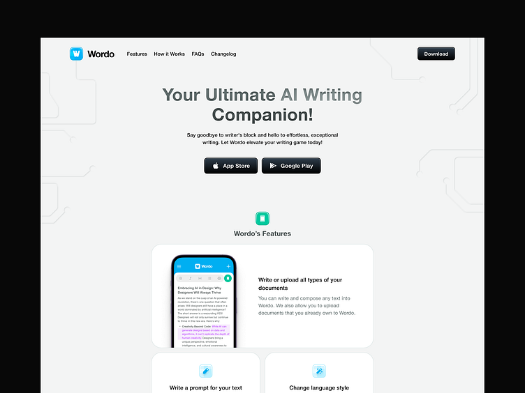
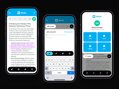
Hello everyone, I would like to share an update on my previous post about the AI Writing Assistant mobile app. Today, I want to showcase my exploration of the landing page design. In this design, I have tried a different approach by using a large margin on the left and right sides.
What do you think?
Let me know in the comment section below and don't forget to leave a like to show some support! Thanks! ✨
Full Preview ⬇️
Get in touch with us!
Email | Whatsapp | Telegram | Skype | Book a Call
We are available for new projects 🏄♀️
💌 Email Us: hello@vektora.studio
😍 Social media : Instagram | Linked In | Behance
🛍️ Vektora Product: UI8 | Iconscout | Creative Market | Gumroad | Canva
www.vektora.studio
More by Vektora View profile
Like


