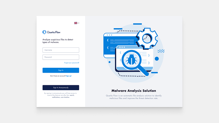
Sign In Page [QF]
The sign-in page for Quarks Flow was designed to be simple and intuitive. The page features a clean, minimalist design that is easy on the eyes and easy to navigate.
The form is designed to be easy to use, with large, easy-to-read text fields and a simple, straightforward layout. The overall design is intended to be unobtrusive and to allow users to focus on the task at hand: signing in to Quarks Flow.
Let me know what you think! If you like it, press "L" for ❤️
More by Danut Mihalca View profile
Like
