Quarkslab Branding
Out with the old
The old Quarkslab logo, while well-established, exudes a sense of traditionalism that might not resonate with modern audiences. In an ever-evolving cybersecurity landscape, where cutting-edge technology and innovation are paramount, the old logo may be perceived as outdated.
In with the new
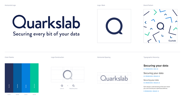
the redesigned Quarkslab logo encapsulates the company's dynamic spirit. A magnifying glass, a universal symbol of looking closer and searching something now encompassed in the "Q" at the core. The "Q" stands strong and resolute, signifying the strength of cybersecurity and also, a reminder that Quarkslab doesn't just protect; it actively defends.
Let me know what you think! If you like it, press "L" for ❤️