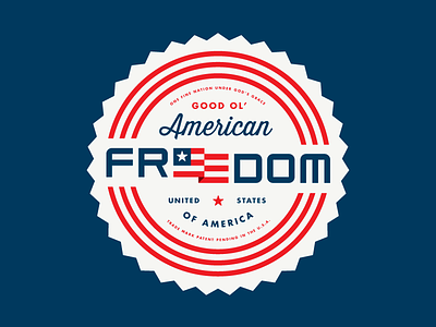
Design taught me good ol' American freedom
“The future belongs to freedom, not to fear” -Kerry
It’s time to take risks. The work should push not only the client but should also make us slightly uncomfortable. That’s how you know it’s good.
The best design work is brilliant because it’s surprising. Fear based work is the opposite of that. It’s boring to look at and even more boring to make. You’re not going to change the world unless you take risks.
Let’s do this people!
A M E R I C A!
—
This is my submission for Shopify’s “Design Taught Me” competition. It’s also one of my favorite design pieces I’ve created this year. I hope you guys dig it.
—
"They may take our lives, but they'll never take our FREEDOM!" -Braveheart
—
Technical:
The font for Freedom is fully custom designed for this project so that I could match the the stroke width and spacing for the "F", the Flag, the "M" and the outer triple inline circle. The unified weight helps the eye move between the letters.


