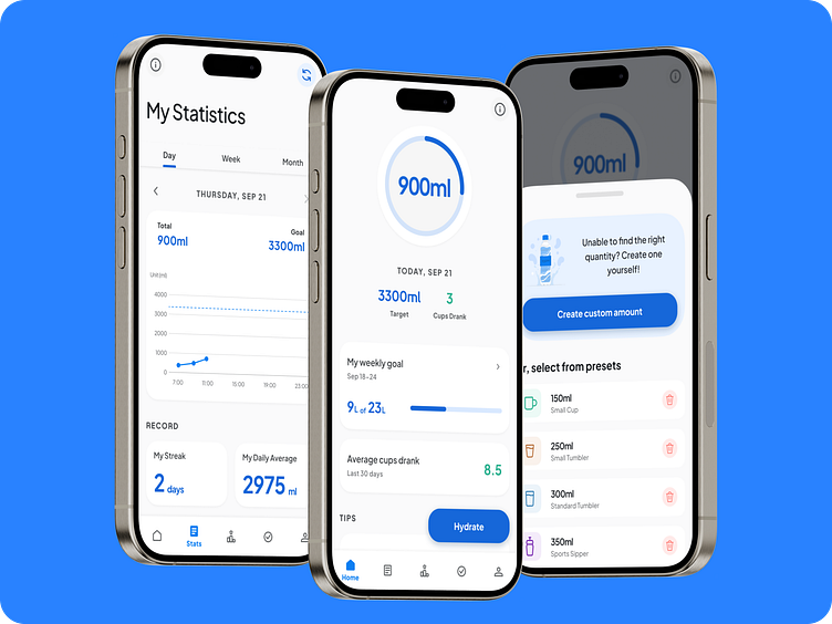
Aqualert App Redesign Concept: From Boring to Thrilling.
The boring UI of the old Aqualert App is long gone!!!
Presenting the redesigned and rejuvenated design that makes your water tracking experience fun and exuberant. Take a look at the fresh home screen design, updated with trackers and new UI components to make the interface modern and aesthetic, while balancing the functionality of the app.
I would love to hear your thoughts. Please like and comment!
Take a look at some of the redesigned screens, along with the new updated app icon displayed below. I took inspiration for some elements from the leading android fitness app, Google Fit.
More by Ayush Prakash View profile
Like


