Into the Fedi.Monster revamp
About the project
Fedi Monster is a great solution to host your own social media, behind a solid infrastructure while enjoying a lot of customization features who make it the more powerful hosting provider of this market.
And that while keeping strong values on ethic values, a vision I deeply respect and share.
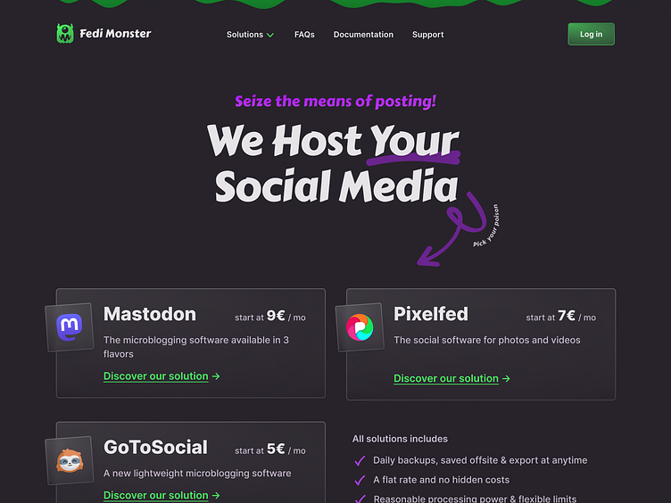
That's why I've put a bit of work in my free time exploring ways to improve the hierarchy of information on the homepage and how the technical details could gonna be shown in less obscure way.
Fedi Monster is an exceptional platform for hosting your own social media. It stands out with a robust infrastructure and a wide range of customization features, making it one of the most powerful providers in the market!
Moreover, the people behind it upholds strong ethical values no mater what, a vision I deeply respect and align with.
In my pursuit to contribute to this project, I've spent some time outside of my work a few months ago, exploring ways to enhance the homepage's information hierarchy.
My first goal was to present technical details in a clearer and more accessible manner, so the quality and diversity of the services can be brought to light!
(Duh Tixie, you just described what interface design is, genius… 🤷♀️🙄)
Woah, fresh new look incoming! 💚
Indeed I've also dug into into refining some branding elements (👻BoOoOoOoO!). Though it's definitely a work in progress.
While the work is moving forward, it's for now not quite there yet.
I aim for a strong visual identity who doesn't to mimic another tech company from the Silicon Valley bubble, to truly mirror the radical motivation that drives this entire project and its sturdiness.
What's next?
The front pages are one thing, but the user dashboard is where all the magic happens.
The user dashboard
For that, I plan to work closely with the team to be able not only enhance an interface that would improve the client experience but also to develop a future-proof design-system that will enable the team to be self-sufficient in terms of UI.
For that I'm planning to really get into the thick of it with our small but mighty crew. We're going to have lots of back-and-forth to make sure we nail the interface that will be efficiently for the users.
The second goal is to piece together a "design system"(?) that's not just aligns with our current nuanced needs, but will also ensure to sets the team up to handle their own updates and developments down the line.
The administrator toolkit
That other part gonna be a more of a invisible work for users.
With the big help of Milia's large technical skillset (my partner in crimes at Guérilla.Studio), I intend to make an excellent connection between the infrastructure guru's needs and the infrastructure constraints. And thus succeed to refine or create internal tools, designed to reduce the burden which currently weighs heavily on the little team's shoulders.
Big challenge for sure!
This is a project that Milia & I believe in deeply — one we've even used ourselves for 5 years now.
Having known the person behind it for a decade and having collaborated on a previous project, it feels natural to put my skills to contribution towards something I'm passionate about and to support our community by providing an easier way to build social communities online, hosted on solid and ethic foundations.
Without the twisted hand of personal's data hoarders & new dopamine dealers. 😒
Community is what will enable us to get through tough times together! 💞
Thanks for hanging in there with me all the way to the end!
Here's to Community, Charity, and Change ✊
Affectionately 💕,
— Tixie Salander
🏳️🌈🏳️⚧️⚢ ∴ ☭️ — Fascists, f*ck off


