Euroasia Healthy Solutions
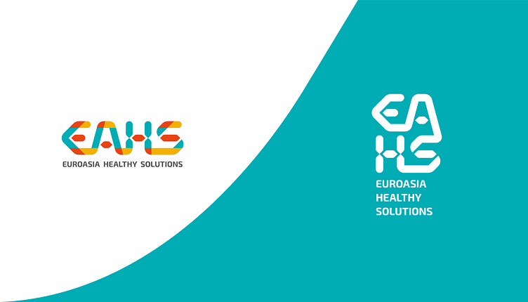
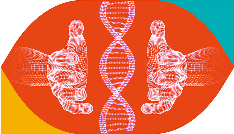
The logo concept for EuroAsia Healthy Solutions draws inspiration from the intricate structure of DNA molecules. The logotype is skillfully crafted to symbolize the strong bonds and connections within the company, as well as between the company and its clients. Additionally, the color palette combines warm tones with a scientific touch, striking a perfect balance between approachability and expertise. This blend of colors evokes a sense of warmth, vitality, and trust, while still maintaining a scientific and professional feel.
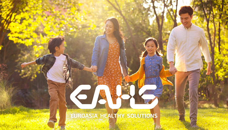
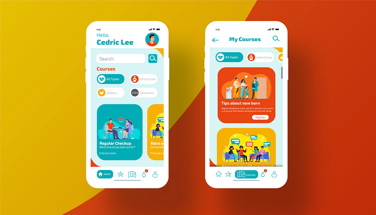
The brand’s logo communicates the essence of Well-being and WellCare through digital solutions and product models that focus on nutrition and overall well-being within the context of preventive care. The new identity represents a large organization that provides cross-cultural wellness solutions for users of digital well-being programs. EuroAsia Healthy Solutions aims to make inexpensive and affordable courses accessible to anyone in need, enabling them to access valuable well-being and preventive health information.