Case Study: Information Architecture
The Company
EM is a B2B web application for Special Education teachers and related staff. Their goal is to consolidate and organize student data that can be easily shared among staff while following research-based best practices.
The Challenge
EM is reached out to me in 2017 for help with the visual design of their fledging application. The co-founders showed me the web app's three main pages while we discussed its purpose and goals.
As we dug deeper into the pain points of the current user experience, it became clear that a deep dive was needed on multiple fronts: user research, information architecture, visual design & branding, prototyping and testing, and a concise goals statement for EM's overall product vision.
Information Architecture
In its original state, EM's product consisted of three main features: An individual student's learning biography, their personalized recommended strategies, and a roster of students for each teacher.
Pain points:
1) The current features could not efficiently be navigated
2) The current information was not easily discoverable
2) The current organization of information did not allow for scalability
From there, we dove into Information Architecture. Our goal was to organize all current and future content so that it was easily findable, discoverable, and usable by a Special Education teacher.
Content audit and Sitemap
The first step was to perform a content audit of everything within the web app. We organized current and future content within a hierarchy of a feature spreadsheet. This work allowed us to determine which content should live within each feature, what could be deprioritized at the moment, and how we envisioned the content to scale.
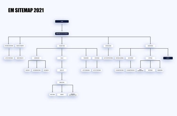
Next, I sketched a rough sitemap of the original web app vs. my proposal. In the original sitemap, content flowed sequentially, whereas in the proposed sitemap, the "list of students" became the home page, and the two other pages became its children. This proposal lended well to ideation for various levels navigation across the web app.
Sitemap in 2021
During the four years I worked at EM, our product exploded in complexity. As we fleshed out current features and created new ones, it became clear that investing in Information Architecture fostered EM's growth into a powerful data tool.
User research and testing showed that creating multiple levels of navigation that were organized in a hierarchy was the easiest and most intuitive way for teachers to navigate, organize, and share their data.
Conclusion
Careful product planning via Information Architecture led to the success of EM in 2021, as evidenced by the ease at which it could be navigated, the efficient discoverability of various data types, and by the ability for features to continue to scale.


