Visual balance on buttons
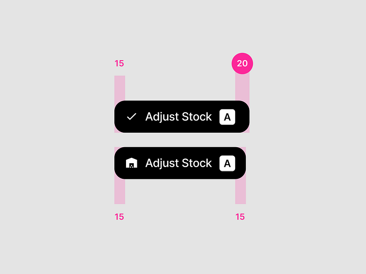
Two similar buttons.
Icon, label and a keyboard shortcut indicator. Same contents on both buttons.
Only the icon is different.
On the button with an icon that has more visual weight, equal padding on both sides works. This is because the keyboard shortcut indicator has almost similar visual weight as the icon.
On the button with an icon with lighter visual weight, the opposite side to the icon needs more padding to balance out. This is because the icon side visually feels like it has more padding due of its lighter visual weight.
This calls for an interesting question. How do you develop a button component that serves this case well? How do you develop a button that would respect visual weight of its contents and therefore creates visual balance with just the right amount of padding?