JBU
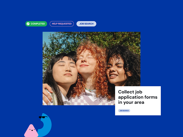
The JBU app's design is a well-thought-out response to the unique needs and challenges of its target audience - homeless youth in San Diego. To address this, the design ensures that the app's content is concise, easily digestible, and organized in a way that minimizes distractions.
In addition to this, we've infused the design with bold and vibrant colors. The colour scheme is not just visually appealing; it plays a pragmatic role in guiding the user's attention. By using contrasting colors strategically, we ensure that vital elements within the app are readily noticeable, facilitating seamless navigation and user engagement.
Wanna connect or team up?
Don't miss any of the shots:
Or, say hi at hello@weareneopix.com
More by Neopix View profile
Like
