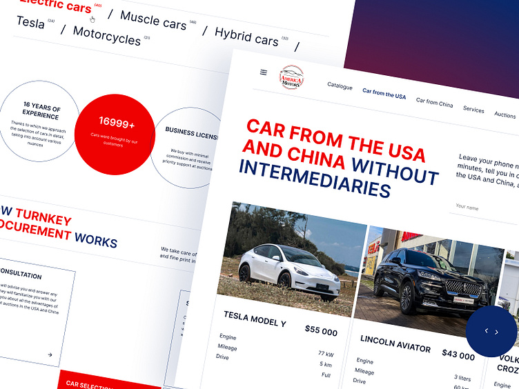
America Motors — Main page Redesign
Hello!
Take a glance at the my design concept of the main page for the website of a car sales company from the USA and China. The task was to radically change the design and presentation of information on the site. It was decided to create a laconic, strict and at the same time modern design on a white background using the red color from the logo as an accent, blue and its derivatives.
Just scroll for full preview, Enjoy!🌞
Interested in partnering with me?
Say hello at yevgeniyanizhnik@gmail.com or https://t.me/YevgeniyaNizhnik (Telegram)
Have a nice day! See you soon😊
More by Zhenya Nizhnik View profile
Like


