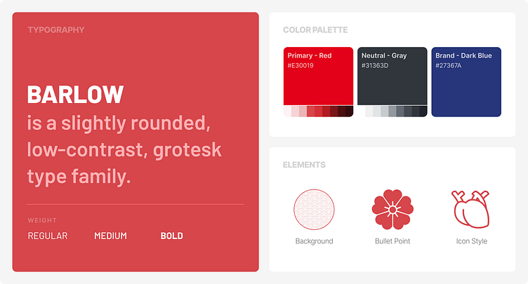
Japanese Style Bento Moodboard
Pharmacy product web redesign.
A mobile and web redesign for a product with ingredients extracted from Japanese nattokinase (fermented soybeans).
For detailed case study, please click ➡️ here
----
Behance | Linkedin | Portfolio
Available for works: lowenguyen.mar@gmail.com
Hero Section
In the banner area, the arrow buttons were hard to click because they were small and blurry. Additionally, users had difficulty knowing if there were any other banners, which made it hard to revisit a specific one. To prevent this, I added a number progress bar.
The Risk of stroke test section had been relocated (with introduction content) to replace the position of a video, which was outdated and had many problems such as:
Unclear purpose - what purpose did it serve?
Because it is a promotional music video and has no subtitles, if the user didn’t turn on the video sound, it was almost impossible to know what the content was.
And the video could only be paused or played, not rewinded or fasted forward.
Our Products Section
I added “Benefits of NattoEnzym” section which only appeared on the Products page in the old design.
I simplified the icon style and aligned its colors with the entire page. Also, I customized the icon to better match the content conveyed below.
Graphic elements were added to align the goal of using existing key visuals and ensuring consistency throughout the entire design theme.
For the Our Products section, I included a brief introduction to 3 main products, instead of keeping all 6 products.
The arrow buttons were relocated to the same location as the number progress bar, near the "Learn more" button, to streamline mouse movement and save time.
In additional, I ensured that the product stood out and became more distinguishable through visual elements, font size adjustments, and the use of representative colors.


