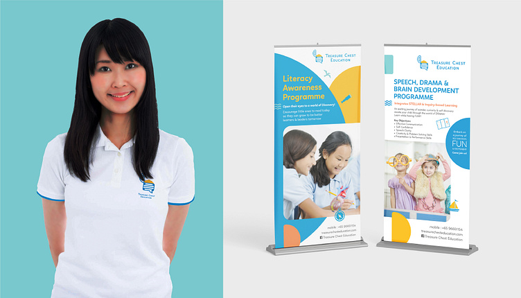
Treasure Chest Education
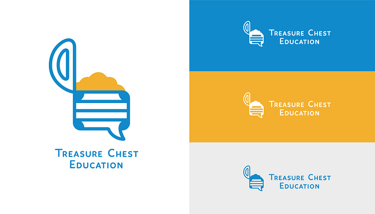
The Treasure Chest Education logo project embarked on a rebranding journey to align the brand with the present context. Moving away from the previous clipart logo, the brand underwent a transformation to establish itself as more relevant and engaging. A significant addition was the incorporation of a touch of blue, strengthening the brand’s connection to the sea theme and effectively distinguishing it from competitors. The new logo symbol took the form of a simplified side profile of a treasure chest, while the logotype was given a rounded design, making it more appealing and friendly to both children and parents.
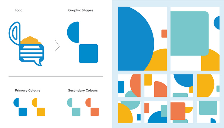
The graphic system employed for the brand project consisted of simplified shapes, such as rounded semi-circles and rounded squares. These elements were strategically combined to create a dynamic composition, resulting in a strong and distinctive graphic style for the brand. This approach not only enhanced the visual appeal of the logo but also conveyed the brand’s commitment to creativity and innovation.