MAAN HOME | LOGO DESIGN & BRAND IDENTITY
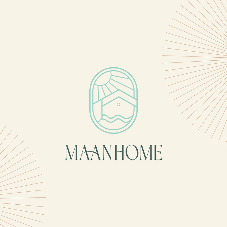
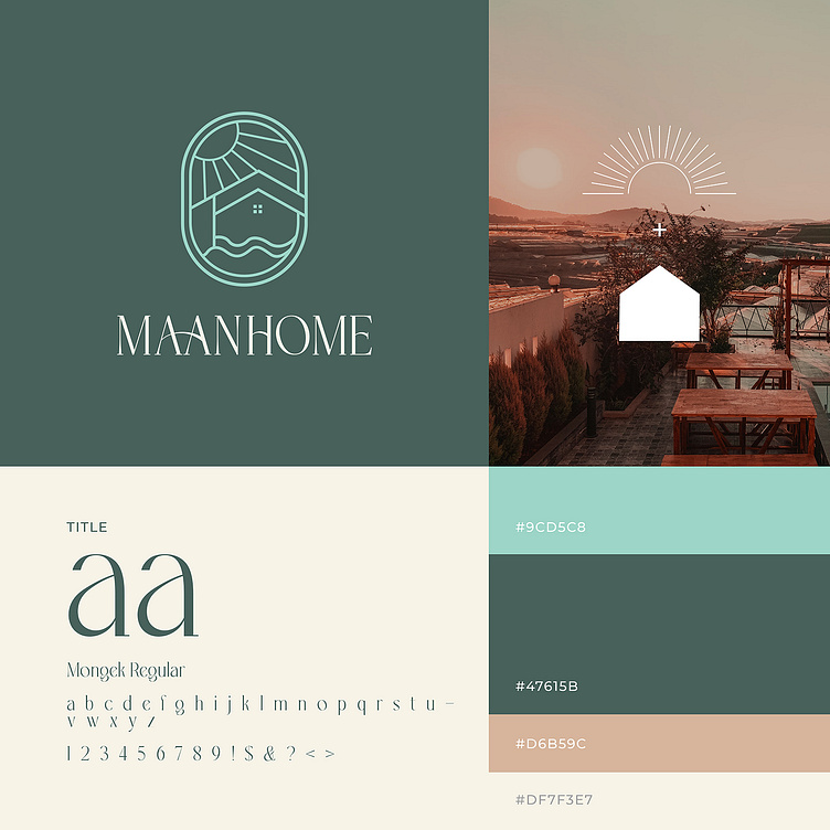
MAAN HOME is a small homestay located near the sunny Vung Tau coast. From the image of the homestay, Bee Art has simplified the image of a peaceful house under the brilliant golden sunshine to design logo for MAAN HOME.
Using bold serif fonts shows the professionalism and reliability of the homestay. This can make customers feel secure when booking and know that the service will be provided professionally. The mint blue color in the logo represents the color of the sea associated with green and the natural environment, expressing the homestay's desire for a peaceful environment, close to nature. Milky white color brings a feeling of purity and clarity., showing the cleanliness and quality in the service provided by the homestay. Milky white color expresses sophistication and simplicity in design. This may reflect MAAN HOME's minimalism and focus on comfort and professional service.
Designed by Bee Art
-
Client MAAN HOME
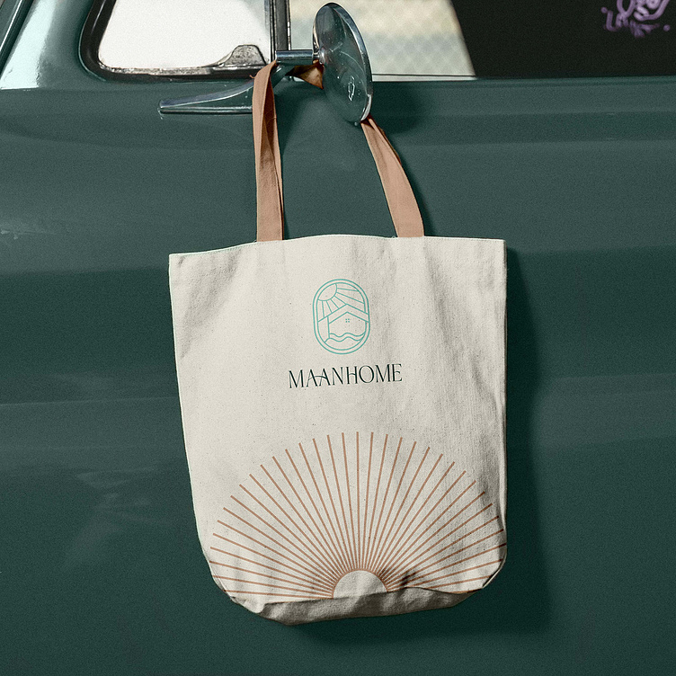
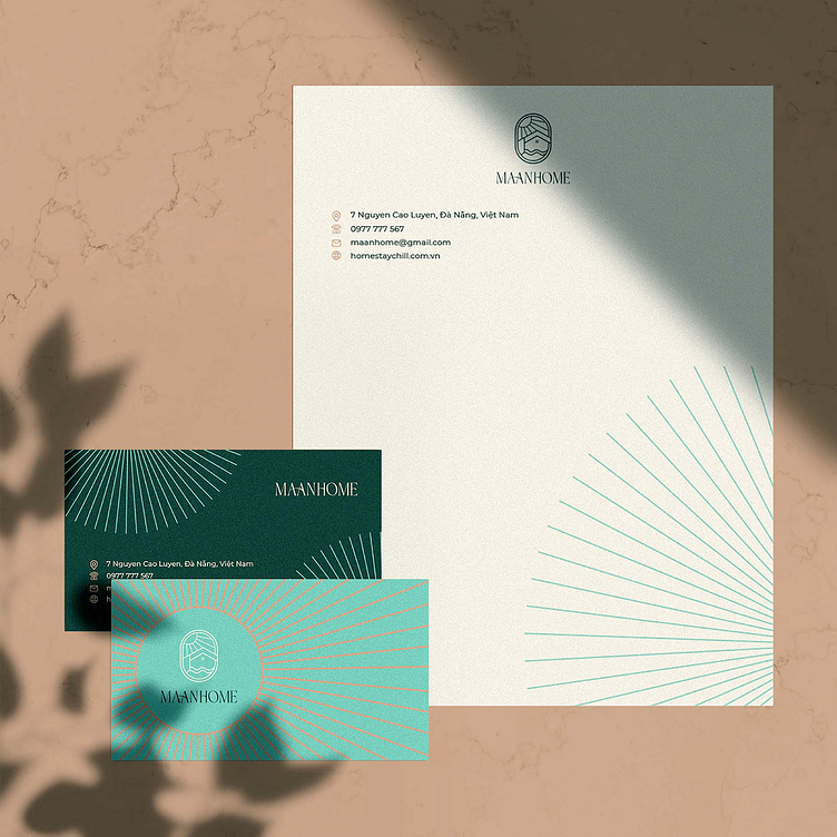
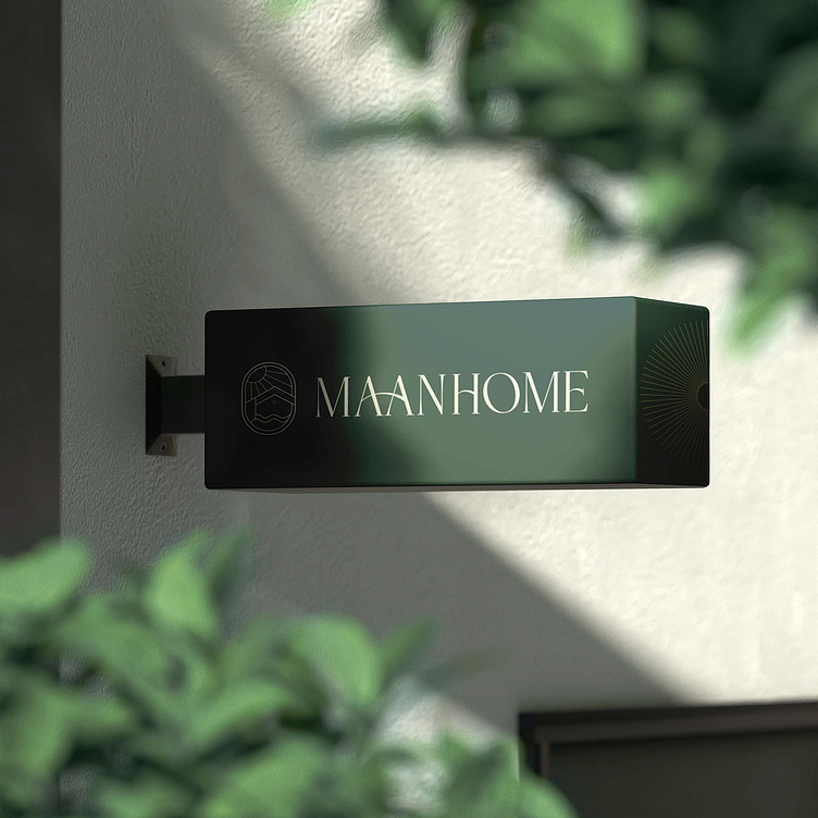
Logo and Branding Project. Logo is designed for Homestay in Vung Tau City, Viet Nam.
Copyright © Bee Art. All Right Reserved
Contact us:
• Hotline/ Zalo: (+84) 77 34567 18
• Email: info@beeart.vn
• Website: www.beeart.vn
• Facebook: https://www.facebook.com/BeeArt.vn