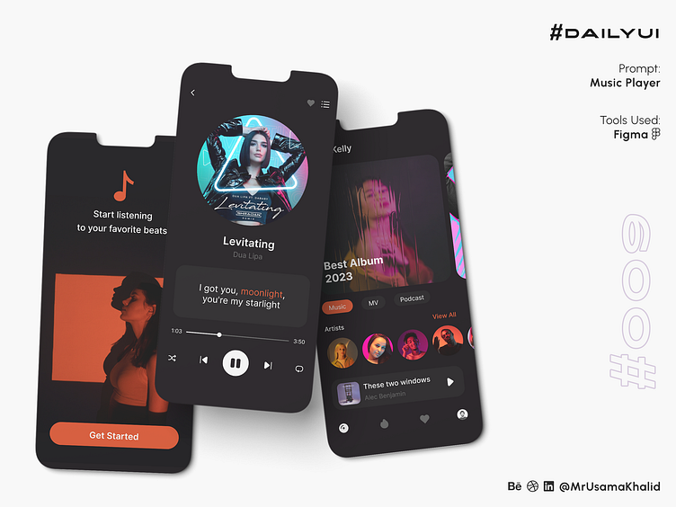
Music Player #DailyUI
#DailyUI
Challenge #009
Prompt: Music Player
Tools Used: Figma
Design Theory
The design theory behind my minimal music player app screens is to create a simple, yet visually appealing and easy-to-use interface for music lovers of all kinds. The use of a limited color palette of orange and black creates a bold and striking look, while the minimalist aesthetic ensures that the focus remains on the music itself.
Motivations
Using Black & Orange
The orange and black color scheme is a popular choice for music player apps because it is both eye-catching and versatile. Orange is a vibrant color that is associated with energy, creativity, and excitement. Black is a contrasting color that is often used to represent sophistication, elegance, and modernity.
Together, orange and black create a dynamic and visually appealing color scheme that is perfect for a music player app. The orange highlights the important elements of the interface, such as the play/pause button and the album cover, while the black creates a clean and minimalist background.
Using an Aesthetic Approach
Music is a deeply personal and emotional experience, so it is important to create a music player app that has a visually appealing and inviting aesthetic. The minimalist aesthetic of my app screens is perfect for this purpose. It is simple, yet elegant, and it allows the music to take center stage.
The use of negative space in my app screens is also a key part of the aesthetic approach. Negative space, or the empty space around the elements of a design, can be used to create a sense of balance and harmony. It can also be used to draw attention to the important elements of a design.
In the case of my music player app screens, the negative space around the play/pause button and the album cover helps to highlight these important elements. It also creates a sense of spaciousness and openness, which is appropriate for a music player app that is designed to be used by a wide range of music lovers.
The design of my minimal music player app screens is both visually appealing and easy to use. The use of a limited color palette of orange and black creates a bold and striking look, while the minimalist aesthetic ensures that the focus remains on the music itself. The overall design is sure to appeal to music lovers of all kinds.
Let's connect ✦✦✦
Let me know your thoughts in the comments.
I always love to receive feedback on my work!
Please share to help me promote my work!


