Day 5 — W in a Diamond
This is Day Five of Thirty Days of Logos, in which I share a new logo idea for my design studio, Wildfire Studios, every day for 30 days.
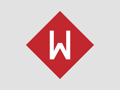
What I like about this W is that it's flexible: while the diamond would be a solid colour, the W could be carved out from it and transparent so that what's behind the logo is always visible. In designer-speak, it would provide context.
The thing is, I did something similar with my current logo and haven't done anything with it in two years. I just kept the logo black and white. So I know I'm not likely to use that "feature" much, although I like it a lot.
Nothing about this really grabs me the way that Day 4's logo did, for example, but it was an idea that I tried. So I'm sharing it today and looking forward to hearing your thoughts and feedback as always.