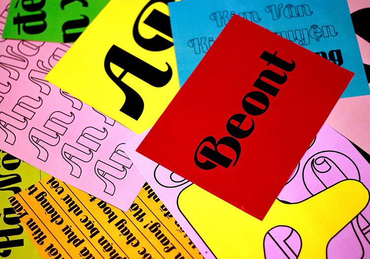
Beont Typeface | Type Design
A project from 2019
Beont is a display typeface inspired by Saigon newspaper typography before 1985. The reason for this type of design project firstly came from my admiration for the elegant typographic titles of contemporary newspapers and secondly from my frustration when using worldwide popular fonts but having bad Vietnamese support.
With the hope of creating a display typeface that was as close to the handwriting of Vietnamese as possible, Beont typeface was born.
The process was both challenging and rewarding
I started by collecting and studying various newspaper samples from Saigon before 1985, focusing on the headlines and titles. I noticed that the typefaces used in these newspapers were mostly based on Latin scripts, but they had some modifications and adaptations to suit the Vietnamese language and culture.
For example, some letters had diacritical marks that were different from the standard ones, such as the circumflex accent (â) and the horn (ơ). Some letters also had distinctive shapes, such as the lowercase g with a looped tail, or the uppercase Q with a curved tail.
Full Showcase Here 👉
Kim Oanh is a digital product designer specializing in experiential design, covering research, narratives, and executions with a user-centric approach.
🟡 W | onlykimoanh.com
🟡 E | chao@onlykimoanh.com
🟡 IG | onlykimoanh
🟡 Be | onlykimoanh


