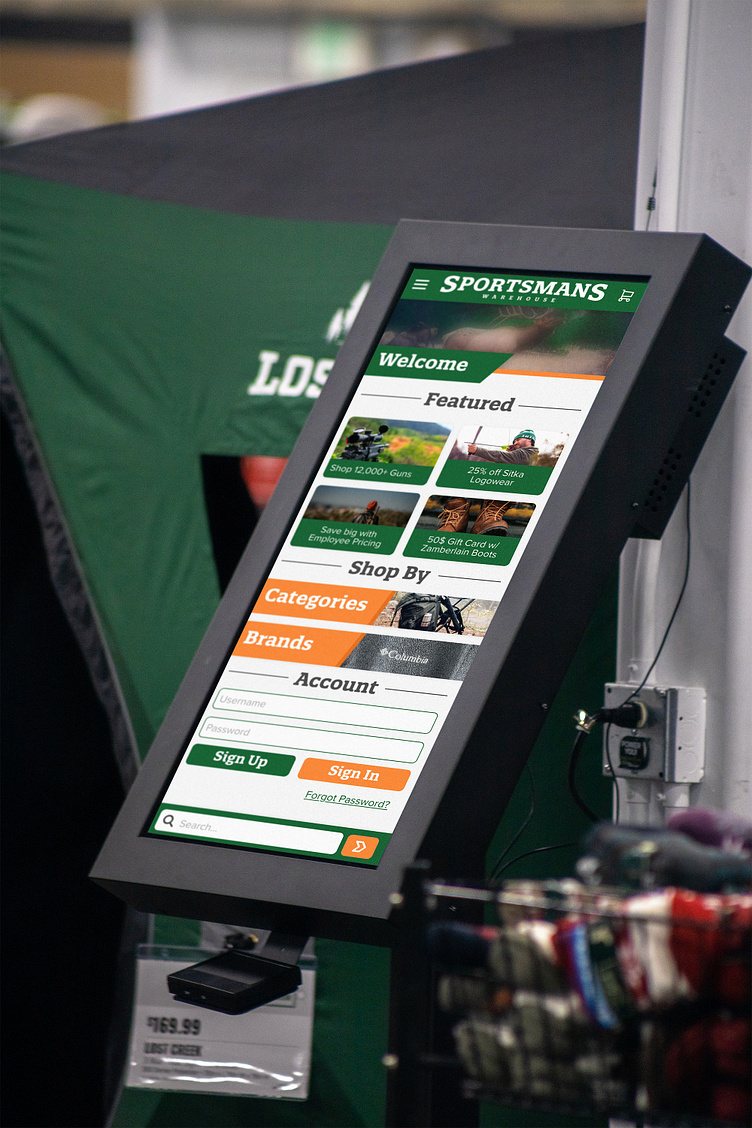
Sportsman's Warehouse Kiosk Design
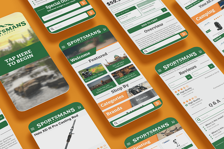
Designing the user interface for the self-service kiosks at Sportsman's Warehouse was a thoughtful process that centered on providing an intuitive and user-friendly experience for customers, especially those who may not be very familiar with technology. The primary goal was to guide users through the shopping process seamlessly, making it easy for them to find and purchase the outdoor gear they need. To achieve this, extensive user testing was conducted to ensure that every step of the interface was clear, readable, and provided users with a clear direction on where to go next.
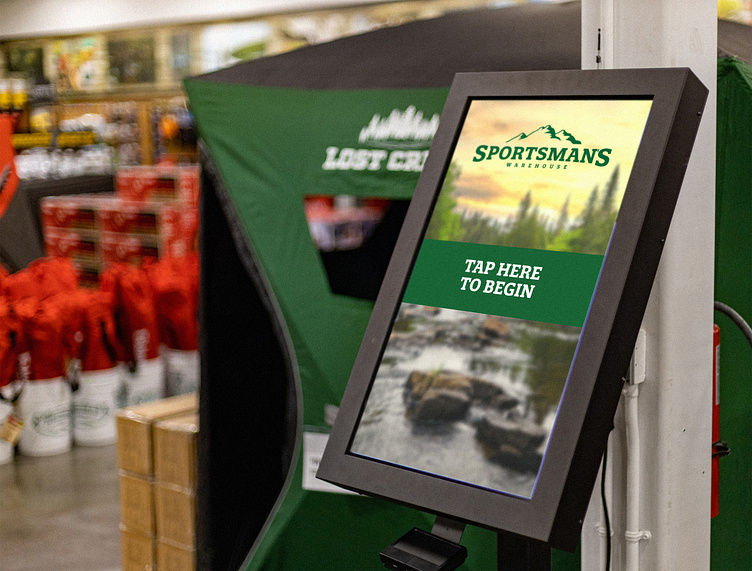
One of the key principles behind the design was to take inspiration from successful self-service kiosk designs from other industries, such as McDonald's. By incorporating familiar user interface elements and interaction patterns that many consumers are already accustomed to, the design aimed to reduce any learning curve and make the shopping experience at Sportsmen's Warehouse as intuitive as possible. This approach allowed customers to feel comfortable and confident while using the kiosks, even if they weren't tech-savvy.
The result of this design process is a user interface that offers a visually appealing and user-centered experience, guiding customers through the store's product offerings with ease. Whether customers are looking for camping gear, fishing equipment, or outdoor apparel, the self-service kiosks now provide a hassle-free and accessible way to browse, select, and make purchases. Overall, the user interface design prioritizes the needs of the customers, making it a valuable asset for Sportsman's Warehouse in enhancing their in-store shopping experience.