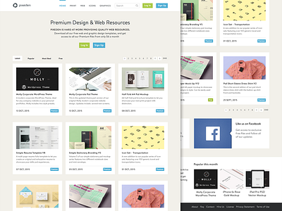
Pixeden Redesign
Was recently clearing out some files to make some room on my computer and came across my Pixeden redesign from earlier this year. It was alright but looking at it now I wasn't happy with it so I decided to take another shot at it. I believe this version is a thousand times better than my last one.
I really like this direction because the current site looks like it hasn't been touched since it was originally made. The Skeuomorphism is still strong on the current site (not necessarily a bad thing) but I wanted to see what it would be like if it were released today.
Full view attached. Any thoughts or feedback would be great!
Update: Decided to do a product page with the same style and attached that as well.
More by Christopher Breitigan View profile
Like


