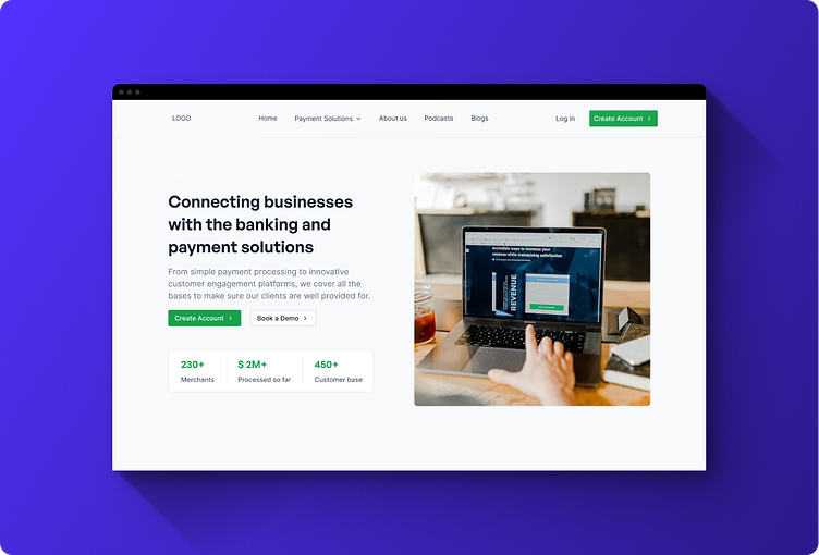
E-payments: Website Hero Section
Here's a hero section of a landing page I recently designed for an anonymous company that connects businesses with banking for their payment solutions.
Why a Redesign?
Outdated design layout of the existing website
Lack of visual hierarchy
Lack of clear Call-to-action buttons and copy
Low conversion rates
Cluttered top nav bar elements - which reduce the visibility of individual menu items, Navigation Errors, Mobile Responsiveness
etc...
Changes I made
Introduced a clear visual hierarchy, guiding users to the most important content and calls to action
Implementation of clear and concise copy ensures that the website's messaging is more effective. Users can quickly grasp the value propositions and benefits my client offers.
Added some impact number metrics as social proof of how this "Business"(my client) is performing for others
Kept only necessary nav bar elements to improve the navigation - Responsive and Mobile-Friendly design
