Sister Cities
An Immersive Desktop Experience
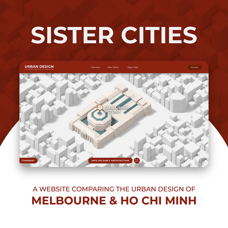
The highlight of the entire user experience is the interactive map in which they can navigate with the cursor to find particular Melbourne and Ho Chi Minh landmarks that are associated with the several fields of urban design. Clicking on the landmark brings it to focus, where the user can learn about that landmark or about the urban design surrounding it. The second slide features an 'itinerary' as a sort of fast travel which is also supported by the main menu displayed on the third slide. The idea was to provide the targeted audience of urban designers and tourists with an enjoyable interactive experience, with the option of efficient navigation as well.
On major field of urban design is that of Architecture, which is gone into great detail in these webpages. The first slide shows a timeline of early and notable architecture of both cities while the second slide shows more modernised architecture, with full analysis of both. The early architecture webpage also entails an interactive 'back-in-time' feature in which users can compare today's buildings with their past appearances. Both webpages also have a quick-navigation setting in the middle to enrich the user experience.
Staying true to the gamified experience of the website, the several other urban-design-related pages offer plenty of interactivity and information for users to divulge into the content. The Road Layout page (1) offers sneak peek photos of those roads once hovered over, the City Districts page (2) allows users to piece together a puzzle of both major cities, whereas the Public Transport page (4) has a little vehicle that follows the horizontal page scroll. Furthermore, two different shades of blue have been used to reflect the two major cities, making it easy for users to differentiate the two.
Mobile Adaptive Design
The entire experience has also been redefined for optimal mobile interactivity, such as vertical map that works in a similar manner, with the navigation bar and itinerary being replaced with an expandable burger menu and search bar.
All the webpages have also been adaptively designed to better suit the mobile screen and offer a pleasant user experience. While not as interactive, there is still life and movement with the user's every interaction, without the loss of any information.
Designer's Notes
With the idea of the interactive map experience in mind, the project began with site architecture and user flow diagrams for both the desktop and mobile versions of the site.
After a good structure of the website had been developed, AdobeXD was fired up to develop some wireframes of both the mobile and desktop versions. Everything was annotated in order to set a clear plan moving forward, as this was a collaborative project. These wireframes were then used as the framework for developing the entire prototype on AdobeXD.
On a side note, all of the map features in terms of the landmarks and buildings were all developed in Blender3D (1). They were then rendered isometrically to be used as images in the Adobe XD prototype. Image (2) is the final product, which is a snapshot of the entire Adobe XD project, including all the desktop web pages and their corresponding mobile adaptations.
'Sister Cities' was an RMIT university assignment, made in collaboration with Alan Kubasov, Riven Ramin Husin, Ken Wui Lee and Anh Vu Le.


