RESPONSIVE WEBSITE DESIGN
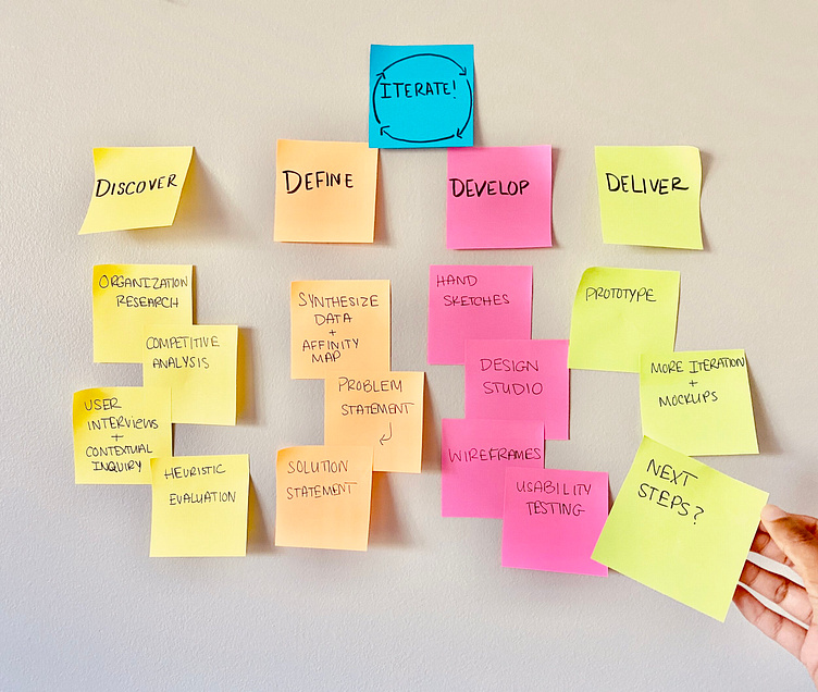
PROCESS
My team worked on this responsive design for 2 weeks. Our research started with a deep dive into the work of The Giving Kitchen, to get a better understanding of the business goals and impact.
Conducting user interviews and contextual inquiry helped narrow the scope of the design to the website’s donation process. My team prioritized this flow based on insights we gleaned from users, competitive analysis, and heuristic evaluation.
Once the problem was defined, we moved on to ideation, starting with a design studio and moving on to digital sketches. I found that the global navigation and calls to action were high priority features.
After usability testing and a few iterations, I took our designs to a higher fidelity. After presenting the deliverables at the end of the 2-week sprint, I found some areas I’d like do address in the next steps.
01 | Discover
WHAT IS THE GIVING KITCHEN?
The Giving Kitchen is a nonprofit organization based in the Atlanta metro area, driven to empower restaurant service industry workers by providing them with a network of resources and emergency financial assistance in times of need. The founding story behind The Giving Kitchen is one that evokes empathy and compassion from the get-go, which makes designing a solution for their organization that much more meaningful. Learn more about The Giving Kitchen here.
FOUNDING PRINCIPLES: empathy, generosity, community, precision, trust, gratitude
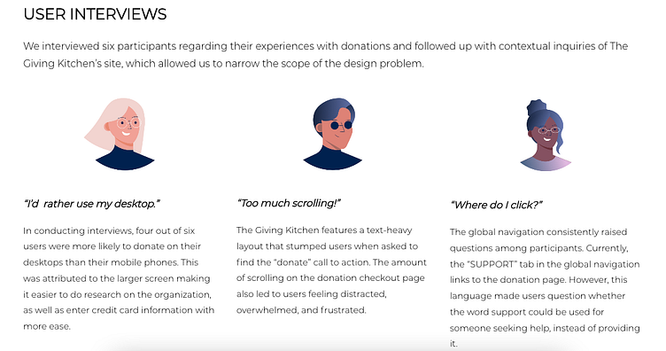
User Interviews
HEURISTIC EVALUATION
(Based on Jacob Nielsen’s 10 Principles for Interaction Design)
User control & freedom
The site lacked breadcrumbs or other indicators of the page currently being displayed, leading to frustration and confusion of where the user landed, and how to return to the previous page.
Aesthetic & minimalist design
Lengthy body text caused users to struggle to find relevant information regarding donating and calls to action. Users also mentioned that the typeface used on most of the site was difficult to read on the screen.

Error prevention
The donation checkout flow did not allow users to review their information before submitting the payment, and the site lacked tooltips to cue users on how to format required fields.
02 | Define
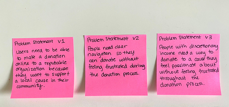
PROBLEM STATEMENT
People with discretionary income need a way to donate to a cause they feel passionate about without feeling frustrated and overwhelmed throughout the donation process.
PROPOSED SOLUTION
By creating a website with clear navigation and a streamlined donation process, we will see an increase in donations and improved usability of The Giving Kitchen’s website.
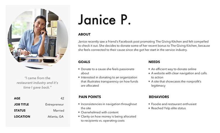
WHO MIGHT A POTENTIAL DONOR BE?
To compile the information from our user interviews into a cohesive identity, we derived the persona, Janice.
Janice was our guide as we started the ideation process, as we knew we had to create a user flow that made sense and was convenient to her needs.
03 | Ideate
SKETCHING THE SOLUTION
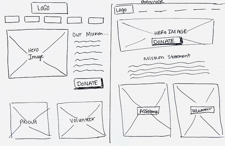
To kick things off, my team did a design studio for one of the key pages our users showed us we needed to work on: the homepage. We wanted to ideate how to provide clear navigation and calls to action for the potential donor visiting the site for the first time.
TESTING THE WIREFRAMES
Usability test goal: Users will complete a $200 donation to The Giving Kitchen in under 3 minutes with no critical errors.
Participant Quote: “It was not clear that I had to select either a monthly OR a one-time donation.”
↓
Iteration: I added a toggle feature that showed that when “one-time” donation is selected, “monthly” donation is disabled.
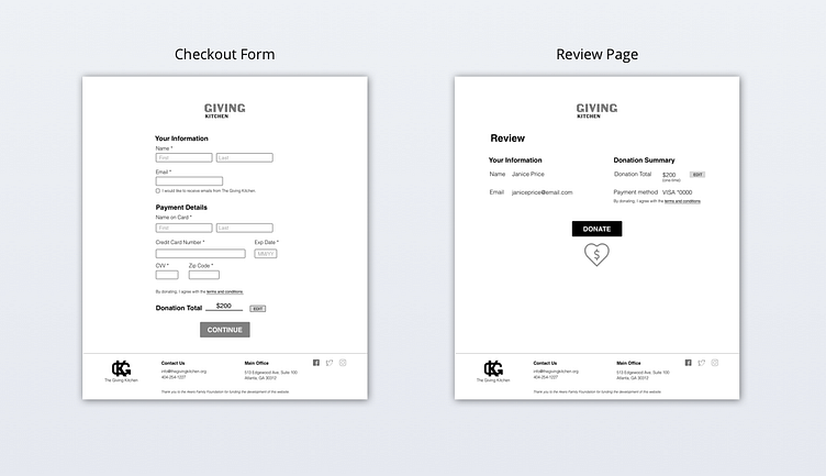
Participant Quote: “I usually like to check out the Terms and Conditions so that I don’t get signed up for auto-pay or a bunch of emails.”
↓
Iteration: I added an overlay to the checkout form so that users could click on a pop-up screen with the nonprofit’s fine print and donation terms.
Participant Quote: “How do I check everything I typed is correct?”
↓
Iteration: I added a review screen where donors can verify and edit their personal information before submitting their donation.
04 | Deliver
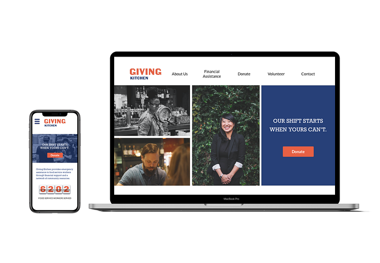
MOCKUP PROTOTYPE

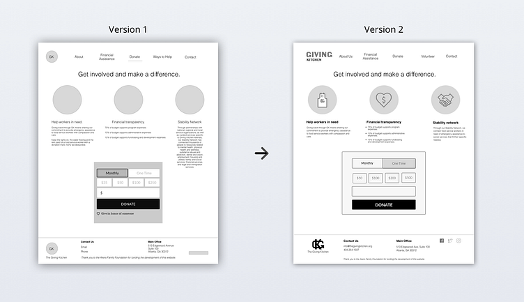
After the first round of usability testing, I was tasked with taking the greyscale wireframes to a higher fidelity comp. While I re-incorporated The Giving Kitchen’s brand colors and some iconography, I introduced some more readable fonts.
05 | Reflection and Next Steps
Empathy for the donor: I learned that when designing for a nonprofit, it is so important to help the user feel connected to the mission every step of the way so that they feel excited and confident to complete the donation process. This design exercise really illustrated the significance of the “why” behind each design decision, because we had to understand the factors that may lead a user to feel more compelled to a donation.
Financial assistance process: During this two-week sprint, our team prioritized the donation process, as we came to an agreement that the donation feature was an integral step in the right direction to acquire more funding and stimulate growth for the organization. Given more time, I would address the user flow of someone coming to the site seeking assistance.
Scalable designs: The Giving Kitchen has released a 2021 Vision with goals for expanding its services beyond the Atlanta metro area, and I’d be impassioned to create a scalable website to match that vision. Some future iterations might include location filtering options, resources tailored to specific areas, etc.
