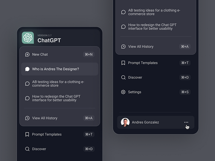
ChatGPT Side Menu Redesign
Chat GPT is awesome. But their side menu is awful 🫣 ... so how could we make it better? This redesign answers that exact question. Specifically, I used three key UX principles, Jakob’s Law (Law of Familiarity), The Aesthetic-Usability Effect, and Improving Visual Hierarchy to decrease cognitive load (aka don't make people think too hard).
Connect with me on LinkedIn
Want this Figma template & tutorial? If I get 400 email sign ups, then I'll give it away for free :) Sign Up Here
More by Andres Gonzalez View profile
Like
