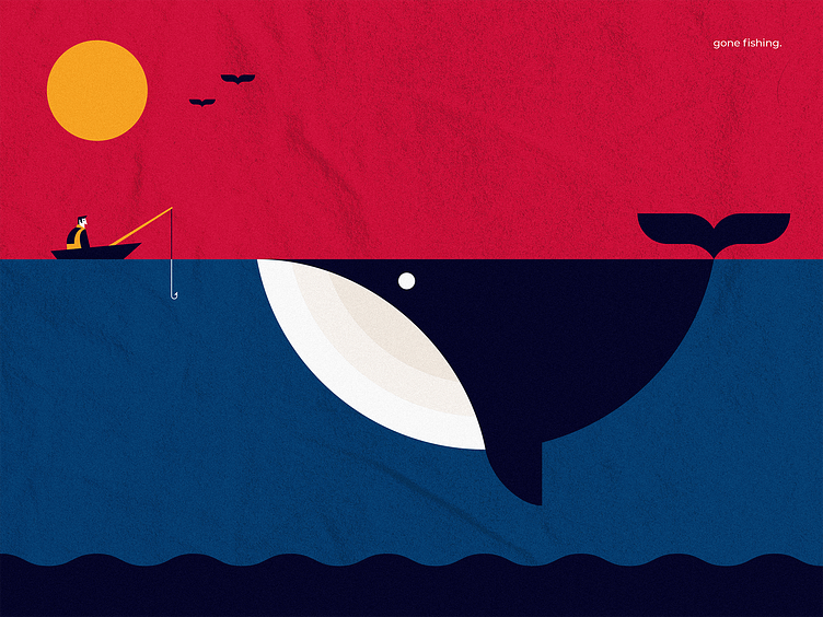
Gone fishing.
For this design I really went back to some of the basics in design, contrast in particular. I wanted to implement a lot of contrast through size and colour in this design. That's why I came up with the tiny fisherman in relation to the big whale.
I also went for contrast in warm and cold using the bright red and yellows in relation to the darker blues. Too make it feel a bit less 'vector', I finally played around with a soft texture in the background. I'm pretty satisfied with the way this one turned out! Let me know what you guys think! Cheers!
More by Steven Reyners View profile
Like
