Case Study: ITCs Industries – Logo & Web Design
Case Study: ITCs Industries – Logo & Web Design
CLIENT
ITCs Industries
DELIVERABLES
Web Design & Logo Design
TEAM
ABOUT THE PROJECT FOR ITCS INDUSTRIES
Welcome to the design adventure behind this innovative website! We embarked on this project with a bold vision, utilizing motion design as our modern muse to bring life and dynamism to a world of fasteners, tools, technical wholesale & consulting, and their remarkable pneumatic tube systems.
Our journey began with a core principle: to break free from static, mundane web design norms. We envisioned a digital experience that doesn’t just display information but tells a story, captivates the audience, and leaves a lasting impression. Motion design was our chosen vehicle for this mission, infusing every corner of the website with energy and vibrancy.
COLOURS & TEXTURES
Our color palette is the canvas upon which the digital experience unfolds. We’ve chosen blue and orange as our main colors to create a visually striking contrast that not only captures attention but also symbolizes the essence of the company.
Blue, in its various shades, serves as the anchor. It represents trust, reliability, and a deep well of expertise in the technical field. Against the backdrop of a pristine white canvas, blue takes on a commanding presence, reminding visitors of the company’s steadfast commitment to quality.
Orange, on the other hand, injects a burst of energy and modernity into the design. It’s a beacon of innovation, signaling the company’s forward-thinking approach. When juxtaposed with blue, it creates a harmonious visual tension that keeps the user engaged and excited to explore.
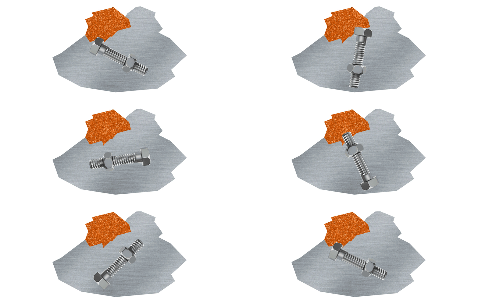
But our design journey doesn’t stop at color. To enhance the user experience and differentiate various sections of the website, we’ve introduced a rich tapestry of technical textures. Concrete textures exude an industrial strength, symbolizing the company’s solid foundation and durability. Brushed steel textures add a touch of sophistication, evoking precision and craftsmanship. Sandpaper textures introduce a tactile dimension, inviting users to engage with the content. Lastly, circuit board patterns subtly hint at the technological expertise underpinning the pneumatic tube systems.
These textures, rendered in shades of grey and black, act as visual dividers, seamlessly guiding users through the website’s diverse offerings. Whether you’re navigating through the products, delving into technical consulting these textures serve as signposts, ensuring a smooth and intuitive journey.
In essence, our color palette and texture choices are more than just aesthetics; they are the embodiment of the company’s multifaceted identity. Together, they create a visual symphony that tells the story of a family company deeply rooted in tradition, yet always evolving, always innovating.
TYPOGRAPHY
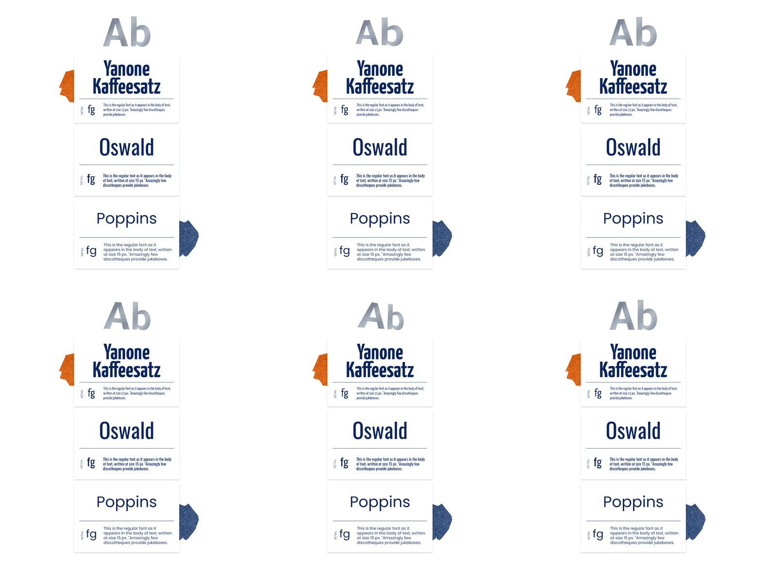
The typography for this website was carefully chosen to create a modern and visually appealing design. The headings are set in Yanone Kaffeesatz, a sans serif font with a strong presence. This font helps to grab attention and make the text easy to read. The menu is set in Oswald, another sans serif font with a clean and minimalist look. This font helps to create a clear and concise navigation system. The body text is set in Poppins, a versatile sans serif font that is both readable and stylish. This font helps to create a comfortable reading experience for the user.
In essence, this project is a testament to the power of design to encapsulate a company’s legacy and aspirations. Through motion design and a harmonious play of colors, we’ve forged a digital experience that not only showcases technical prowess but also invites users to embark on a journey of discovery and engagement.


