Education Program Website
Context
This was an concept of how an education program website might look like if I were to design it with my current design sense.
Some design decisions I made
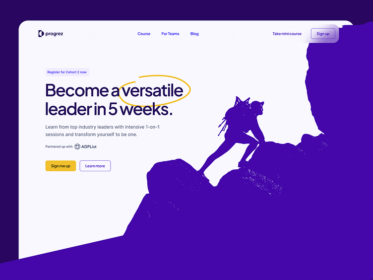
Used an image of a person climbing up to indicate progress and visualizing the dream to be a versatile leader.
Chose yellow as the primary color to help CTA stands out from the purple-themed page.
Social proofs to increase trustworthiness of the program.
More decisions...
Highlighted the program's main value with yellow circle.
An interactive member card where visitor can change the name to help visualize what a program member will own.
Described "what's inside the program" briefly to be more memorable.
And some more!
More social proofs to push that trustworthiness again.
Recapped the program's values and provided a CTA to dismiss scrolling-up.
Added when the discount would end to urge visitor to make a decision faster.


