Portfolio Site v2
The 2nd Rendition of my Portfolio Website
It had been a few years since I had developed the first version of my portfolio website, so it was time for an upgrade with the new skills that I had learned. The new website with a large focus on interactivity, and a streamlined navigation process that includes most of the content on a single page. It provides access to my resume and socials, followed by sections about me, my skills and projects.
Main Page
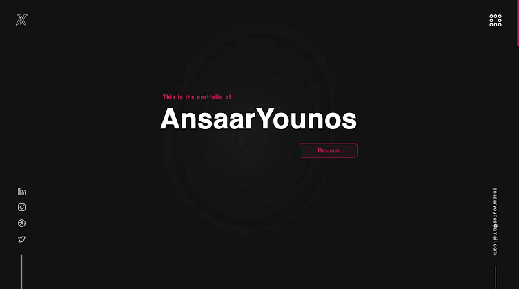
The landing page is overflowing with interactivity, with the website responding almost wherever the cursor is. My name becomes highlighted once hovered over, as well as the socials and emails that bounce up to indicate them as interactable elements. Furthermore, the bento menu in the top-right corner goes through a couple of changes as it is being used. To top if off, my signature piece sign is hidden somewhere on the landing page, which the cursor reveals.
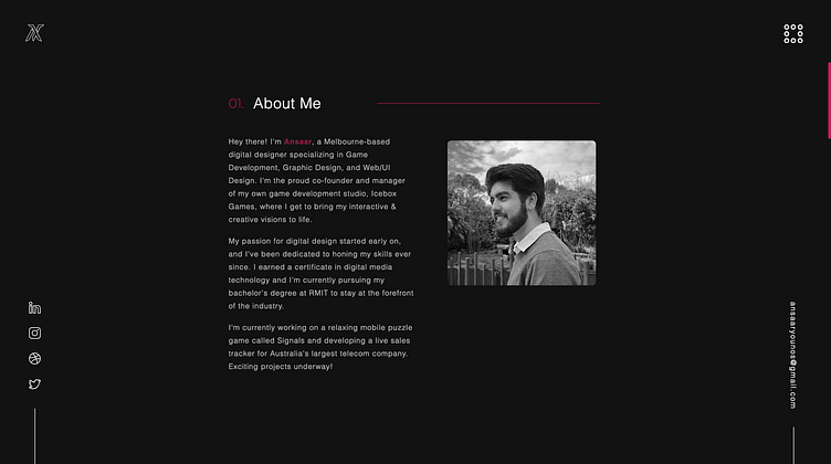
Followed by the landing page is the about me section. It provides a concise overview of my intentions and experiences, as well as a picture for audiences to put a face to the name. The red text of my name also changes to it's arabic translation once hovered over to hint my middle eastern background.
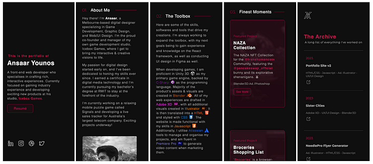
The next section is my tools and skills. Iconography has been used to showcase my 'toolbox', which is enhanced with the hover effects that also depict their names. Right underneath is also some of my experiences and clients.
The section that follows is a few of my best works. Overlays are added to the images to keep consistent with the colour scheme of the website, where hovering over it shall reveal the real colours. All mentionable parties have also been hyperlinked to allow for audience access.
Followed by this is a small collapsed section that shows some other notable works, as well as access to the full archive of works. Keeping in tune with the interactivity of the website, the little folder icons open once hovered over, indicating the opening of a webpage, while also adding a slice of life.
This page finally finished off with a call to action and button that directly opens the user's email should they want to contact me. A back to top button has also been added for user experience.
The Archive
Accessible from the projects section of the main page, is The Archive, in which all of my work is listed, with their date of publication, title, associated skills, as well as a link to see more. The colour scheme and theme of interactivity are honoured here as well, with the fun addition of the disappearing briefcase like the peace sign on the main page.
Adaptive Design for Mobile
To top it off, the entire website has been made adaptable for mobile, in which the elements actually change entirely to suit the mobile experience, as opposed to simply shrinking.
Designer's Notes
The user interface design is simple to use, with a range of affordances taken into account to optimise the user experience. It maintains a consistent visual aesthetic that employs a single colour where focus is required, establishing a hierarchy. It's interactivity makes the website a very moving and animated experience, which is supported by it's smooth movement and fast loading. The entire site was programmed using HTML, styled with CSS and made functional with Javascript.
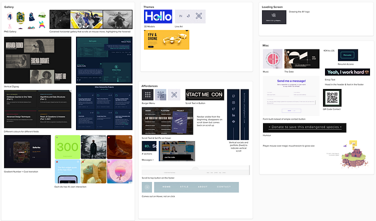
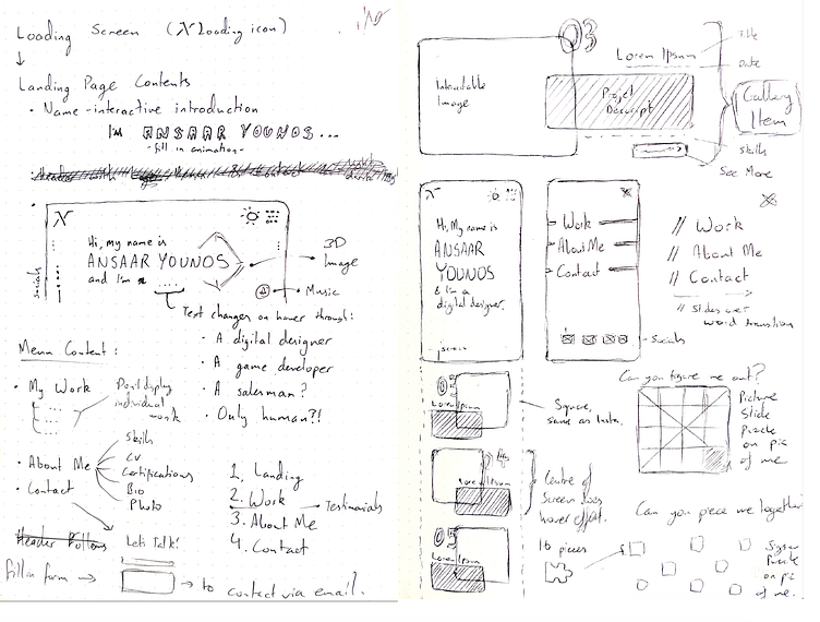
A Mural board was used for research when drawing inspiration from other online portfolios. Some notable inspirations are those by Sharlee, ByExperience, and Patrick David. As for the UI design, went back to my roots with this project, drafting everything in a minimal manner on paper, which I used as a reference when developing the final product.