Artrium | Brand identity
Artrium is a digital space where users can discover, explore, and engage with art-related content. The main mission of Artrium is to establish connections among millions of artists, art professionals, and enthusiasts across the globe. Users can stay updated on the latest trends, developments, and opportunities in the art world, while also fostering meaningful connections and collaborations with like-minded individuals.
Artrium envisions itself as more than just a platform; it aspires to be a supportive company that actively contributes to the creation and enjoyment of art and related content. By providing a space where artists can showcase their work, art professionals can promote their services, and enthusiasts can immerse themselves in a vibrant artistic community.
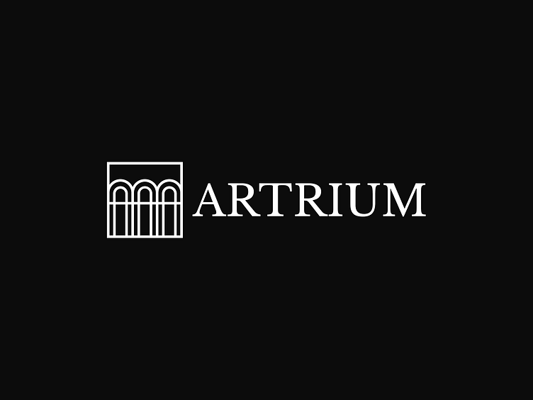
The name Artrium is an amalgamation of two words: 'art' and 'atrium'. In the Artrium logo, we have combined key elements that reflect the brand name. These elements include the letter "A," which is the first letter in Artrium, as well as the atrium and its windows, symbolizing spaciousness, openness, and possibilities associated with platform.
For the color scheme, we chose three primary colors: blue, red, and yellow. These three colors are the primary ones in the palette and can be mixed to create various shades and other colors. This reflects the diversity of art and the opportunities for expression and creativity that the Artrium brand enables.
The main inspiration for the key visual is the galleries with paintings, where you can find a variety of frames. We have created some basic shapes illustrating these frames to be used in graphics. Key visual convey the beauty and diversity of art, as well as highlight the importance of framing and presentation in visual works.
Press L if you like it and don’t hesitate to drop us a line if you want to collaborate!
Don't forget to follow us and your dreams 💫


