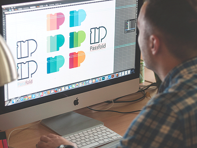
Case study: PassFold Logo
Hi guys! Hope your week is pleasant and fruitful!
This Monday I posted here the small presentation of the case study in our Blog that was devoted to the design process of creating UI for the PassFold project. And, as it was promised, the new case study by Tubik Studio wasn't slow in coming!
So today I would like to present you one more case study about PassFold, this time revealing the process of logo creation accomplished by our studio designer Arthur Avakyan. As usual, the article is packed with loads of photos showing the whole way from sketches to polished digitized version of the logo and its adaptation to different operational systems and environments. Welcome to read, guys!
This project, as many others with multiple design tasks on UX/UI, branding and logo, app and web animation design which we complete in our studio, showed how important it is to set the tight connection between all the design elements and make them feel as one integral unit. Considering this factor makes the final product not only more good-looking, but also more intuitive and efficient. Hopefully, the ideas we share with you will get someone inspired and might be helpful in search of new design solutions. Great day to you all!

