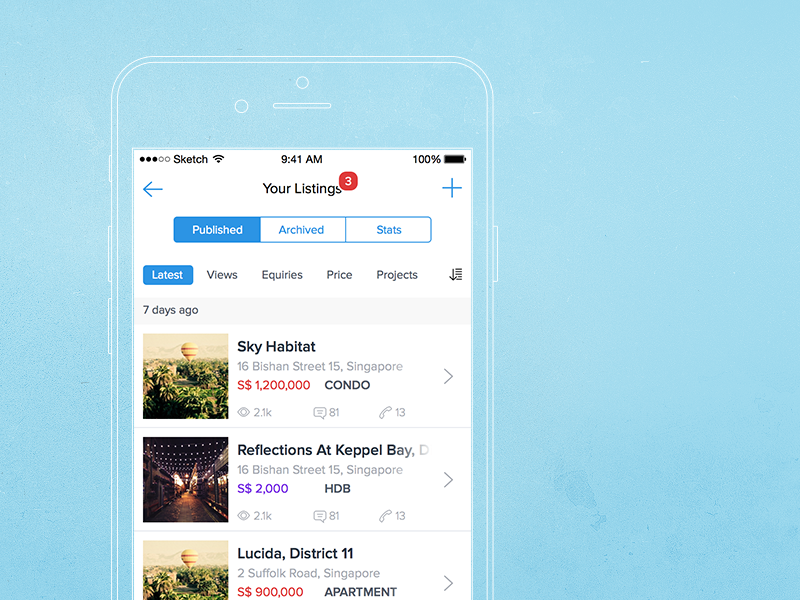
Agent Dashboard First Mock
A quick mock up for the agent dashboard. Apparently, we are trying to provide most options at the glance but while maintaining the simplicity and also keep everything big enough for easy-access since the user group is above 40s. Feedback is welcome.
PS: Do you find the active/inactive status look odd?
I am on twitter too :)
More by kailoon View profile
Like


