404 Page UI UX Design 🔥
🔥 Introducing a unique spin on the traditional 404 error page!
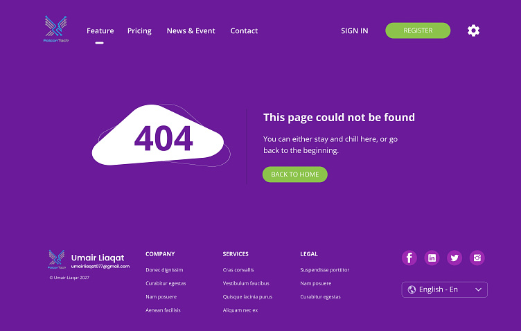
Here's what makes our design stand out:
1️⃣ Vivid Color Palette: Dive into a sea of rich purples that captivates users even when they're lost.
2️⃣ Minimalistic Graphics: Our cloud-shaped error sign seamlessly merges style with simplicity.
3️⃣ User-Centric Messaging: Instead of the generic "Page not found", we've opted for a more friendly and inviting message.
4️⃣ Intuitive Navigation: With clear CTAs and easy-to-find home redirection, users can get back on track in no time.
5️⃣ Consistent Branding: From the top navbar to the footer, every element echoes the brand's identity, ensuring a cohesive user experience.
🌐 Whether it's an accidental detour or a curious click, make your visitors' 404 journey a visual treat! Swipe to explore the details and share your thoughts. Let's elevate the error page game together! 🚀
If you're impressed with this error 404 design and need something similar or custom-made, don't hesitate to reach out.
Contact me, Umair, and let's bring your vision to life! 📩
⭐Let's connect! 🌐
📧 Email: umairliaqat077@gmail.com
📱 WhatsApp: Quick Message
🔗 LinkedIn: Umair Liaqat
#404Design #WebDesignTrends #UserExperience #UI #UX #UIUX #UI UX design #DigitalArtistry #BrandConsistency #DribbbleShowcase
