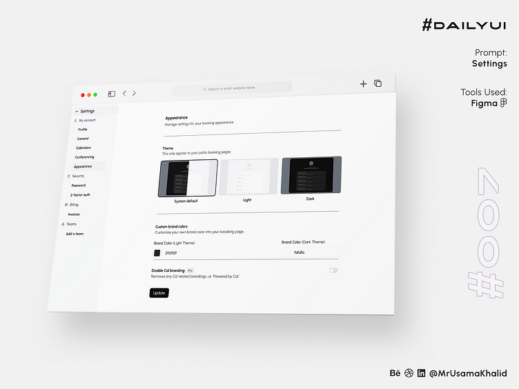
Settings #DailyUI
#DailyUI
Challenge #007
Prompt: Settings
Tools Used: Figma
Design Theory:
The design of the appearance settings screen is based on the following principles:
Simplicity: The UI is uncluttered and easy to scan, with only three options to choose from.
Clarity: The text labels are clear and concise, and the icons are easily recognizable.
Consistency: The UI uses the same design elements as other parts of the SaaS software, creating a consistent user experience.
Why it is easier to navigate and understand:
The appearance settings screen is easier to navigate and understand for the following reasons:
Limited choices: The user only has three options to choose from, which makes it easy to make a decision.
Visual cues: The use of icons and color coding helps the user quickly understand each option.
Logical grouping: The options are grouped together in a logical way, making it easy to find the setting you are looking for.
Design Analysis
The appearance settings screen is a well-designed example of a simplistic and user-friendly UI. The limited choices, visual cues, and logical grouping make it easy for users to navigate and understand.
Here is a more detailed analysis of each design element:
Limited choices: The user only has three options to choose from: System default, Light, and Dark. This limits the cognitive load on the user and makes it easy to make a decision.
Visual cues: The use of icons and color coding helps the user quickly understand each option. For example, the sun icon for the Light theme and the moon icon for the Dark theme are easily recognizable.
Logical grouping: The options are grouped together in a logical way. The System default option is listed first, followed by the two customizable options, Light and Dark. This grouping makes it easy to find the setting you are looking for.
Appearance Settings
The appearance settings screen is a simple and straightforward UI that allows users to customize the look and feel of their SaaS software. The screen features three options: System default, Light, and Dark.
System default is the default theme of the SaaS software. It is based on the user's operating system settings.
Light is a light-colored theme that is ideal for use in well-lit environments. It features a white background with black text and icons.
Dark is a dark-colored theme that is ideal for use in low-light environments. It features a black background with white text and icons.
To change the appearance of the SaaS software, users simply need to select one of the three options on the appearance settings screen. The change will be applied immediately.
Ease of Navigation
The appearance settings screen is easy to navigate and understand because of the following reasons:
Minimal options: The screen only features three options, which makes it easy for users to quickly find the setting they are looking for.
Clear and concise labels: The text labels for each option are clear and concise, making it easy for users to understand what each option does.
High contrast: The text and icons on the screen have a high contrast ratio, making them easy to read and see.
Logical grouping: The options are grouped together in a logical way, with the System default option listed first, followed by the two customizable options, Light and Dark.
Overall, the appearance settings screen is a well-designed UI that is easy to navigate and understand. The minimal options, clear and concise labels, high contrast, and logical grouping make it easy for users to customize the look and feel of this SaaS software.
Let's connect ✦✦✦
Let me know your thoughts in the comments.
I always love to receive feedback on my work!
Please share to help me promote my work!


