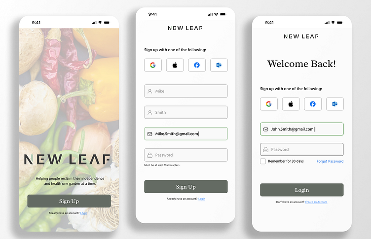
Signup Page
Here is a sign-up page for a (fictuous) non-profit company called New Leaf. The company focuses on permaculture and nutrition. In addition to the sign-up page, I created two more screens: a new user landing screen and a login screen.
My main goal was to create a seamless user experience with a strong visual hierarchy. To achieve this, I placed important elements such as the company logo and a welcoming message at the top of the page to grab the users' attention. All screens have a contrast ratio of at least 4.5:1 to ensure accessibility and compliance with WCAG 2.1 guidelines. I also simplified the login and account creation screens by using intuitive icons and concise text, which makes the onboarding process more efficient and user-friendly. My aim was to reduce cognitive load and provide an overall positive experience for the user.
