The pitfall of Primary CTA "Get Started"
🚫 Are you losing potential customers due to a common but crucial CTA mistake?
Check again and read this case study to stop loosing conversions.
🔍 Our recent case study revealed a primary CTA pitfall that might be costing you valuable conversions.
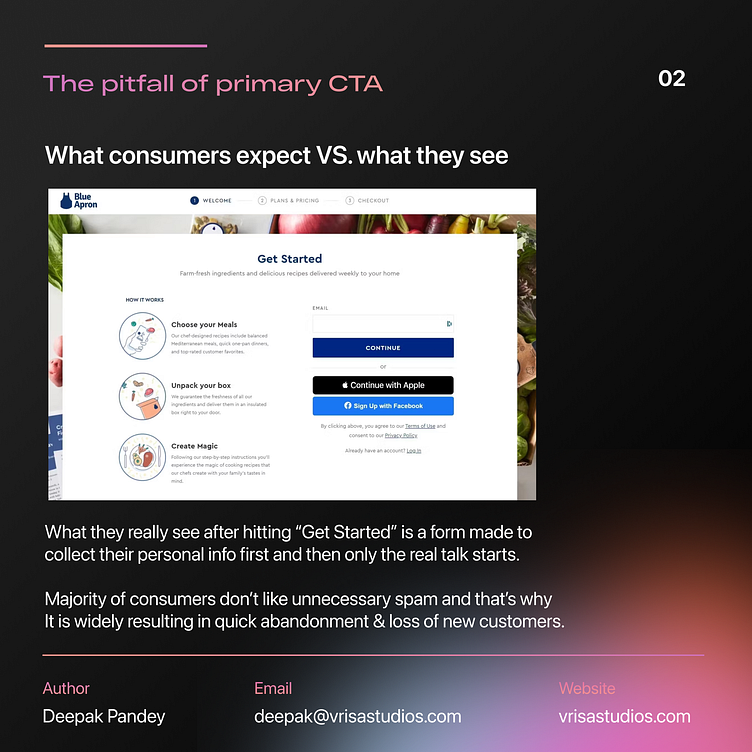
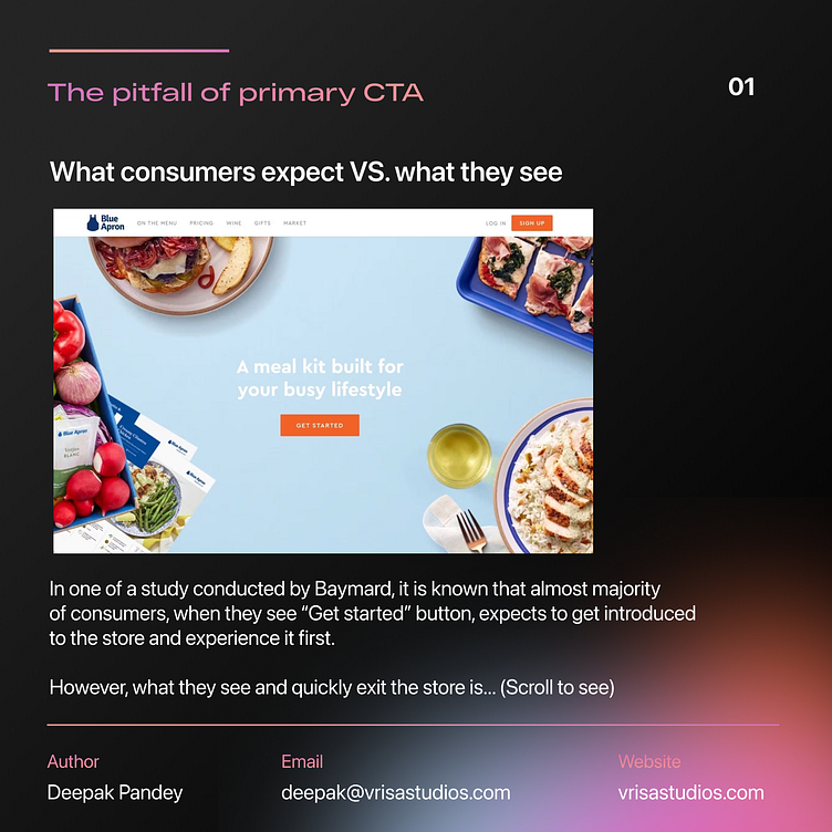
📉 Many meal subscription platforms utilize a 'Get Started' button, but are you aware of the consequences it might have on user experience?👀 When users click on 'Get Started', they anticipate exploring your platform, sampling the interface, and understanding how it works. 🍽️ However, if they're immediately confronted with a lengthy form demanding personal information, it can be a major turn-off.📊
Our study found that this approach often leads to high abandonment rates, leaving potential customers disengaged and unlikely to return.
💔Check the case study till end to understand what to do to solve this and not loose new customers!📈 Don't let this critical oversight hinder your growth! 🌱
Want such expert minds to take care of your brand? We at The Vrisa Studios do provide dedicated team of UX Designers, Researchers and eCom specialists to take care of end-to-end product needs, working in the same timezone on a simple Retainer model.Interesting?
Contact us directly or email on deepak@vrisastudios.com to get started.
#MealSubscription #UserExperience #UXDesign #EcommerceStrategy #CustomerEngagement #oceanbox #dtc #d2c #ecom #baymard #vrisastudios