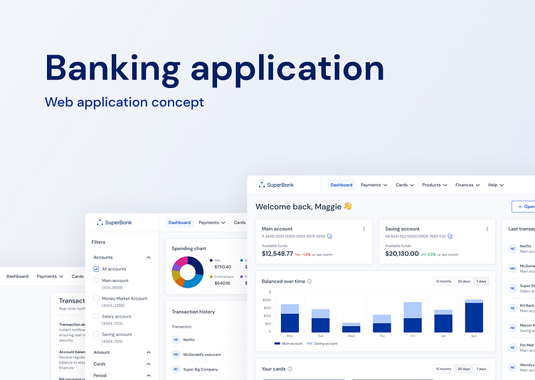
Banking application concept
Hello everyone👋
I am very excited to share with you my new Banking Web Application Concept, which is here to redefine your financial experience. This series of shots will give you a sneak peek into a world where banking becomes more accessible, efficient, and user-friendly than ever before.
Style guide
Starting with in-depth research, I meticulously crafted the typography and color palette for my application concept. Second shot reveals the Style guide, a key element that unifies the design process, ensuring a visually appealing and user-friendly experience.
UI Kit
Next shot reveals the core of every application – the UI Kit. These components, meticulously designed, form the foundation of our user interface. From buttons to input fields, each element is carefully crafted to ensure a seamless and visually captivating design.
Login page
The digital gateway to your financial world. Designed with precision and attention to detail, this page embodies simplicity and security. It offers a seamless user experience with a sleek interface that ensures quick access to your accounts.
Dashboard
This is where your financial world comes to life. With a clean, intuitive main navigation, it's your compass for managing your accounts effortlessly.
Payments details
With a sleek left-side panel housing filter options, you have the control to customize your view. The interactive charts offer a visual representation of your financial data.
But that's not all! The real power lies in the detailed payment information presented in the table below. Every transaction is meticulously listed, providing you with a comprehensive breakdown, from dates to amounts and so one.
Payments details - dark version
What sets this concept apart is the seamless transition between dark and light modes, available at your fingertips in the avatar menu. It's all about flexibility and personalization, ensuring you have the perfect view, day or night.
Settings - changing password
We focus on strengthening your security within application. The first card allows you to change your password, ensuring your accounts are safe and sound with just a few clicks.
The second card provides a comprehensive view of the devices that are logged into your account, offering insights into your account's security.
Simultaneously, our focus extends to your navigation experience. On the left, you'll find a secondary menu, granting seamless transitions between various settings sections.
Settings - notifications
Here, you have the power to customize your notification preferences, tailoring them to your exact needs. From transaction alerts to account updates, you decide what you want to know and how you want to be informed.
Summary
Thank you for joining me on this incredible journey of innovation with Banking Web Application Concept.
Don't hesitate to drop a comment. Your feedback is invaluable, and I'm eager to hear your thoughts and critiques. Together, we shape the future of design. 💬👏 #DesignFeedback #CommunityEngagement


