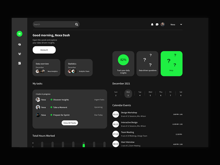
Digital Dashboard for 'Nexa Analytics'
Objective: Design a user-friendly and visually appealing digital dashboard for Nexa Analytics, a B2B company specializing in providing data-driven insights to enterprises. The goal was to help businesses easily visualize and interpret complex data sets.
Design Overview: The dashboard was crafted to accommodate a variety of data visualizations, from bar graphs to heat maps. A modular design allows businesses to customize their view, prioritizing the data most relevant to their needs.
Role & Contributions:
User Experience (UX): Conducted interviews with key stakeholders to understand their data interpretation pain points, leading to a design that streamlines data consumption.
User Interface (UI): Utilized a neutral color palette with pops of color to highlight important data points, making the dashboard aesthetically pleasing and functional.
Interactive Elements: Incorporated interactive tool-tips, drill-down features, and real-time data updates to ensure the dashboard remains a dynamic tool for businesses.


