Audible Campaign Concept
This marketing campaign was created as a concept and strategy get consumers to try a free trial of Audible. I had to persuade “leisure upgraders” in the U.S. and elsewhere that they are right for Audible's services, drive them to sign up for the 30-day free trial, make the company relevant to their lifestyles.
In order to meet these objectives, I researched Audible’s strengths and weaknesses against competitors, made a plan for where the promotional material should focus, and created process work and sketches. With these notes, I was able to create the “what will you download next?” campaign and a wide variety of touchpoints that show different genres and what consumer benefits are included with Audible registration. These ideas were what helped me conceptualize the final branding at the bottom and figure out the appearance of the solutions I had in mind.
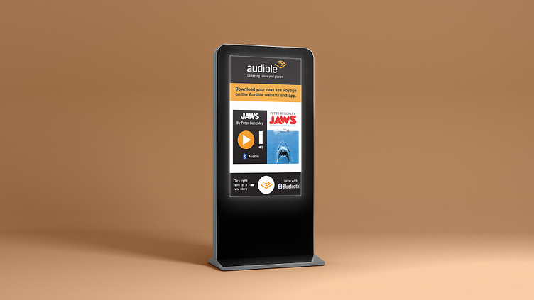
The final solutions and results expanded the campaign in full with mock-ups of both physical and digital promotional pieces. Each touchpoint conveyed a different genre of literature while also using Audible's color scheme and branding. The other area I wanted to explore was making these touchpoint stick out from their surroundings and catch the eye of viewers. By using little details, such as the three-dimensional octopus legs or the vampire teeth sticking out from the top of the bus station, I was able to make unique results that meet this goal and add a playful element to the campaign. The design of the interactive listening kiosk also gave me additional experience in UX/UI design and thinking about consumer interaction with those devices. This project was a fantastic experience since it allowed me to dive deep into several different avenues and think about design in various scenarios.


